Notes on using fonts in computers.
I am writing this file as a guide for using fonts. Fonts have been disproportionately difficult to use because of two reasons:
- A lot of terminology is coming from the times of Gutenberg, and is also constantly changing and inconsistent.
- Computing is largely driven by Latin-writing companies and communities, which have no incentive to make sure that all fonts work across all alphabets.
This file is not about the practice of using fonts for UI in computers, it is about using fonts with documents.
1. References
- Typeface features and legibility research, by Charles Bigelow :: https://www.sciencedirect.com/science/article/pii/S0042698919301087
- Wikipedia
- The Ails of Typographic Anti-Aliasing :: https://www.smashingmagazine.com/2009/11/the-ails-of-typographic-anti-aliasing/
- Modern text rendering with Linux :: https://mrandri19.github.io/2019/07/24/modern-text-rendering-linux-overview.html
- Higher Quality 2D Text Rendering :: https://inria.hal.science/hal-00821839/document
- Overleaf Font typefaces :: https://www.overleaf.com/learn/latex/Font_typefaces
- Fonts and TeX :: https://tug.org/fonts/
- Recent additions to TEX’s font repertoire :: https://tug.org/TUGboat/tb35-2/tb110sharpe.pdf
- The STIX Project — From Unicode to fonts :: https://tug.org/TUGboat/tb28-3/tb90beet.pdf
- Microsoft’s ClearType Font Collection :: https://typographica.org/on-typography/microsofts-cleartype-font-collection-a-fair-and-balanced-review/
- How do I identify a substituted font? :: https://ask.libreoffice.org/t/how-do-i-identify-a-substituted-font/32271
- The LaTeX Font Catalogue :: https://tug.org/FontCatalogue/
- Unicode fonts and tools for X11 :: https://www.cl.cam.ac.uk/~mgk25/ucs-fonts.html
2. Terminology and basic introduction
2.1. Some basic terms
- Character :: ?
- Symbol :: ?
- Glyph :: ?
- Grapheme :: ?
- Typeface :: ? The way the letters look like?
- Script :: A font imitating handwriting.
- Orthography :: A subset of writing system. Say, "writing system"=Han, orthographies: Simplified Chinese, Traditional Chinese, Japanese
- Shape :: ?
- Hinting :: Making character pixels fit the monitor grid.
- Anti-aliasing :: Interpolating diagonal lines to avoid "stairs" effects.
- Kerning :: Moving characters left-right to remove excessive space?
- Serif :: Font with triangular marks which indicate ends of strokes.
- Sans/Sans-Serif :: Font without marks which indicate ends of strokes.
- Slab :: Font with rectangular marks.
- Mono (monospace) :: Font which has all characters of the same width. In reality not actually so, because Han characters are usually 2x wide.
- Half-width :: the width of normal characters in a text, especially when intermingled with wide Asian characters.
- Full-width :: when normal characters are made 2x wide, the same size as Asian characters.
- Term :: Monospace, and also without ligatures and other "helpful" features, text on a grid. Usually Sans.
- Typewriter :: Usually the same as Term, but also often with Slab-Serif.
- Font Set :: When many fonts are combined to make a single set of characters which covers all of Unicode.
- Latin :: Not what you think. Latin usually means "ASCII+diacritical marks", that is, a Latin alphabet combined with é, è, and similar characters for French, Czech, Vietnamese, Latin languages beyond English.
- Roman :: Upright.
- Italic :: Slanted like rotated.
- Oblique :: Slanted like distorted.
- Sample :: Means nothing.
- Fallback :: Also means nothing.
- Regular :: Medium thickness.
- Medium :: ? no idea, but not "medium thickness".
- Normal :: ?
- Light :: Lighter than Regular.
- Bold :: Bold.
- Heavy :: Bolder than bold.
- Black :: Very bold.
- Vector font :: Font drawn using special micro programs, mathematical expressions. May also include pixel fields, if people draw them intentionally.
- Raster font :: Font consisting from pixel fields (which may be generated from a vector-drawing program).
- Hēitǐ (黑体) :: Font in which beginnings and ends of strokes are indistinguishable.
- Sòngtǐ (宋体) :: Font which has beginnings and ends of strokes marked with "fish scale".
- FǎngSòngTǐ (仿宋体) :: No idea.
- MíngTǐ (明体) :: Sòngtǐ.
- KǎiTǐ (楷体) :: Font in which beginnings and ends of strokes differ by width.
- PostScript :: A programming language for drawing vector graphics.
- PDF :: A programming language for drawing vector graphics, incompatible with PostScript.
- TTF (TrueType) :: Vector font format.
- OTF (OpenType) :: Vector font format.
- OTB (OpenType Bitmap) :: Vector fonts format consisting entirely of bitmaps.
- bdf :: Raster font format.
- pcf :: Raster font format.
- psf :: Raster font format.
2.2. What is a font.
- In a common human understanding, a font is a mapping from characters to character shapes.
- In a common programmer understanding, a font is a file which has a mapping from a codepage entry (say, unicode 263A, ☺) to a raster image.
- In a typographer's understanding, a font can be any sort of confusing, weird, unclear and mystical stuff.
This creates a lot of confusion, because everyone sees things differently, and because common intuition always fails.
2.2.1. Overlapping fonts
Fonts may have different NAMES but have identical SHAPES.
For example the Sarasa font claims to combine the shapes from the Iosevka font and the shapes from the Adobe Source Han font.
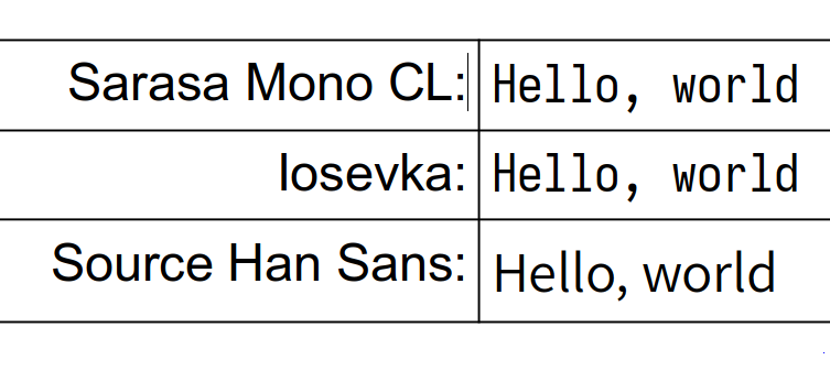 Hmmm… it seems that somebody is lying here.
Sarasa Mono CL and Iosevka are, indeed, identical (although I did not do a pixel-to-pixel verification), but Source Han Sans is clearly different.
Hmmm… it seems that somebody is lying here.
Sarasa Mono CL and Iosevka are, indeed, identical (although I did not do a pixel-to-pixel verification), but Source Han Sans is clearly different.
Alas, font people are lying all the time. I can only guess that Sarasa's authors did not really take the latin part of the font, they only took the Han (Chinese) part.
2.2.2. Font variations
Very naturally, people often want to add emphasis to their words, without radically changing the shape of the characters.
Sometimes they also want to create titles or footnotes, for which they need bigger or smaller characters.
Now, normal people naturally call these small augmentations "font variations", and naturally assume that they are algorithmically generated. It is such an obvious allegation, since it is very natural to imagine those variations to be systematic changes.
Especially since Microsoft Word, LibreOffice, HTML, and other text processing packages pretend as if it is so, and let you apply those variations as if they are systematic programmatic alterations, and that they are independent of each other.

NOT SO. In reality they are NOT programmatic or systematic. Let us have a look at the font-manager presentation.
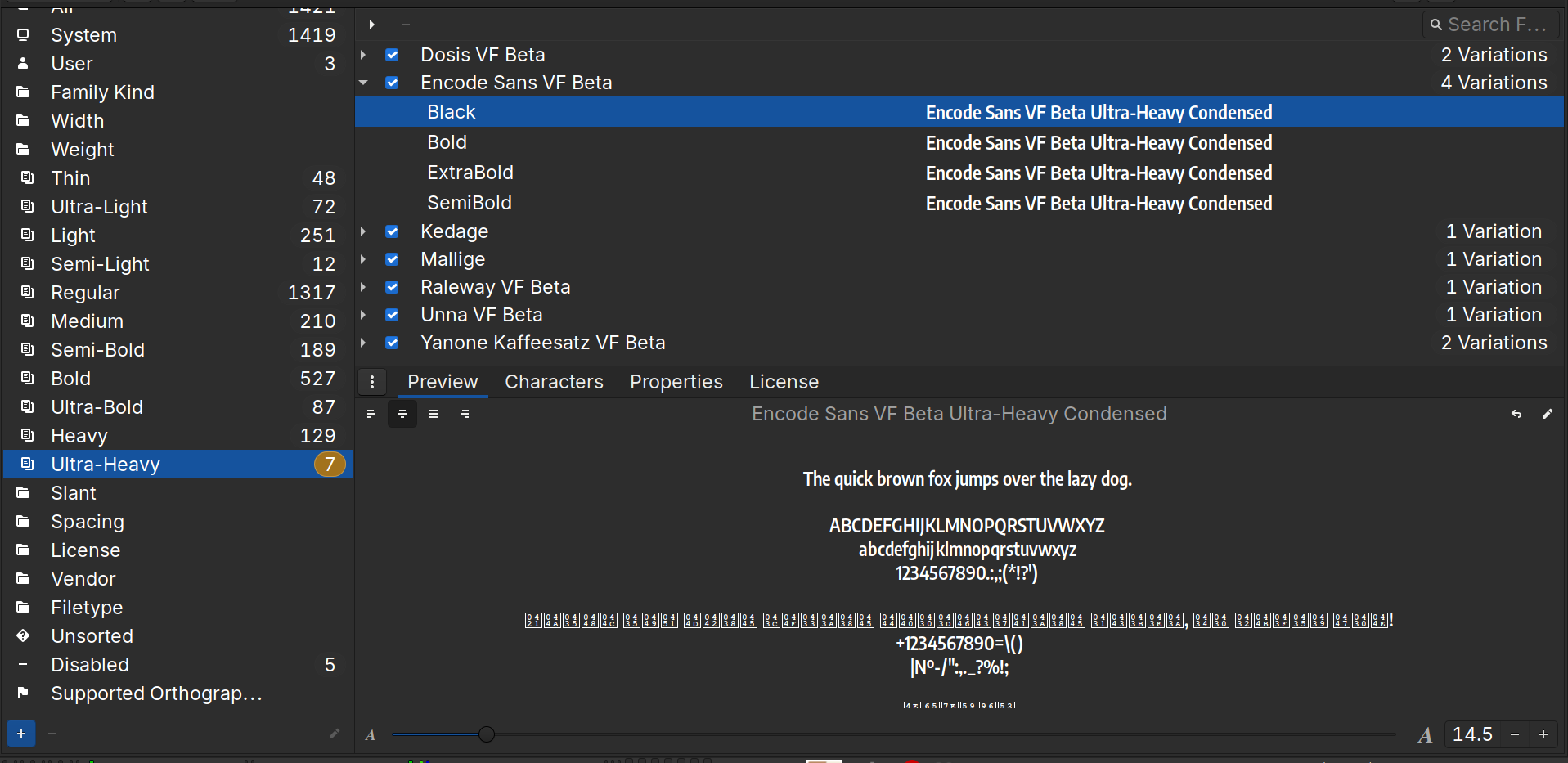
You can see the distribution of fonts between weights. These weights are built into fonts, and are not programmatic augmentations.
Let us look at italics:
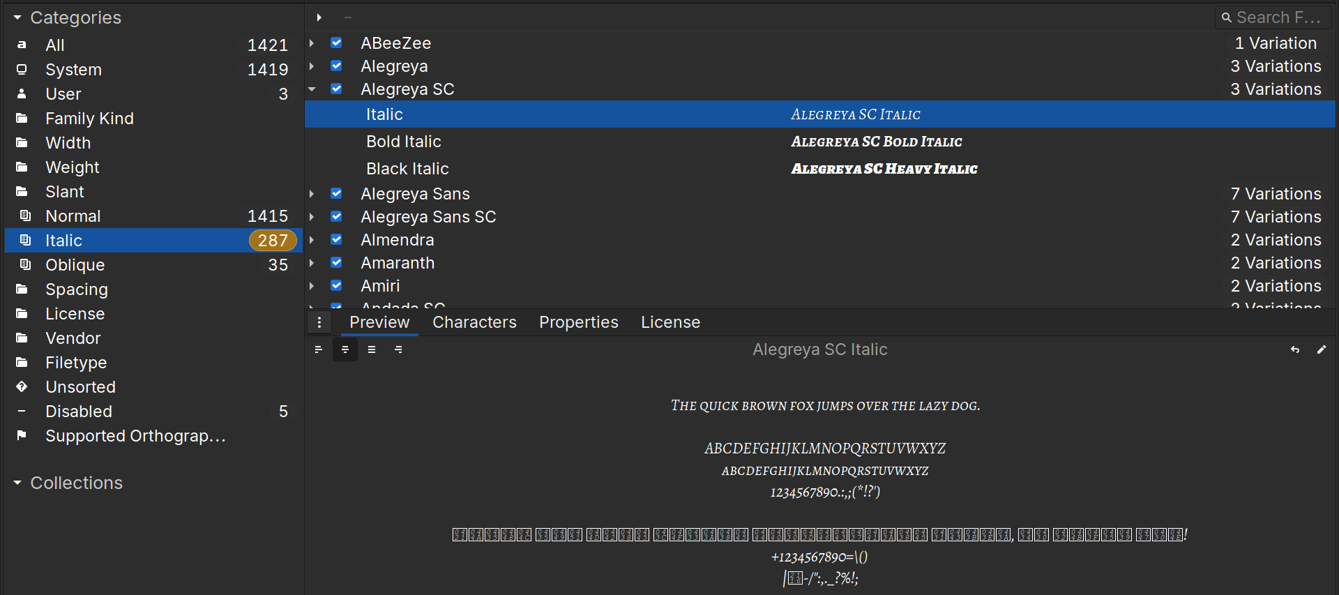
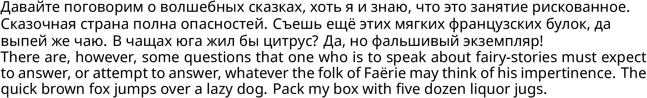
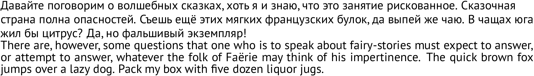
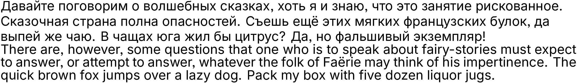
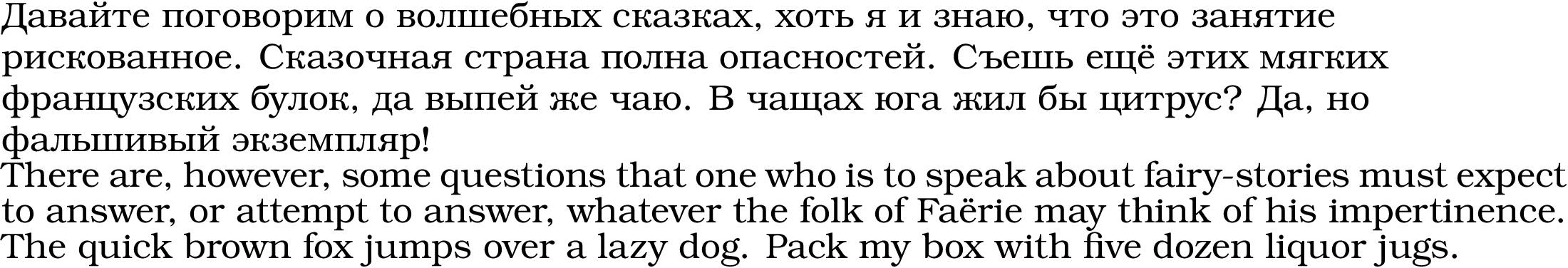
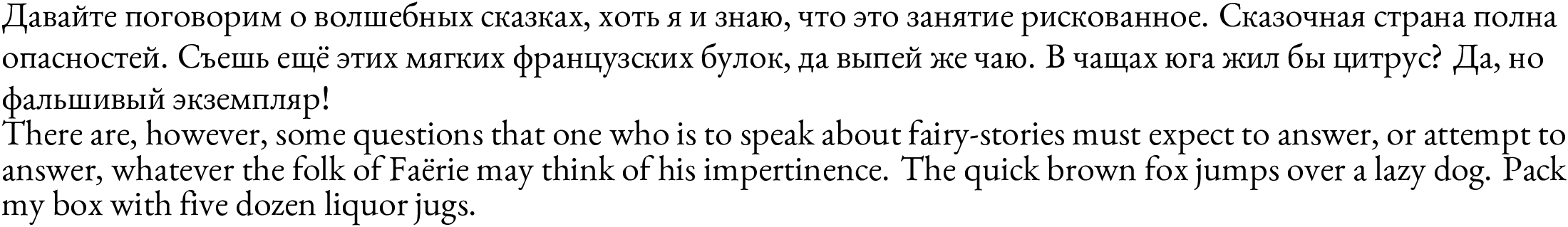
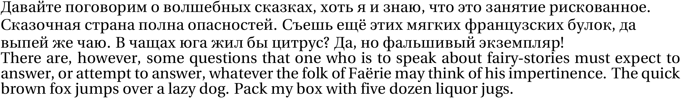
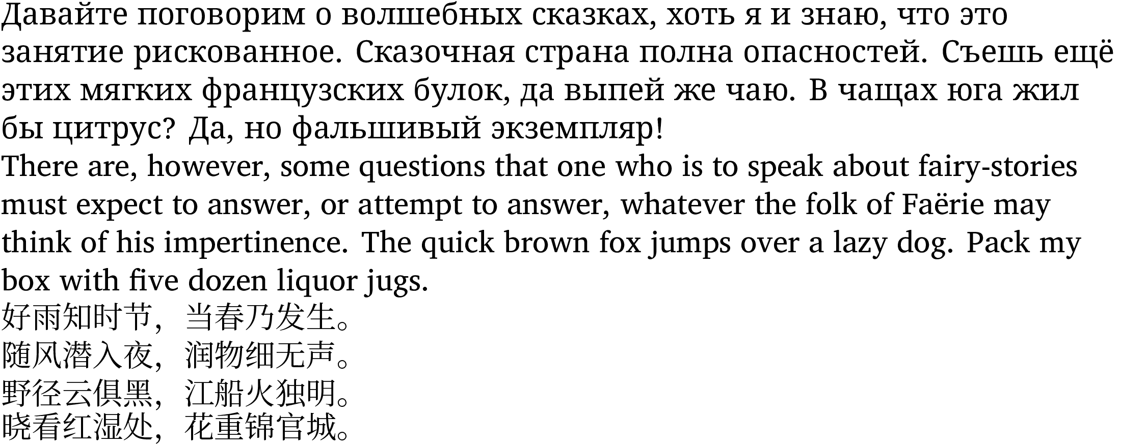
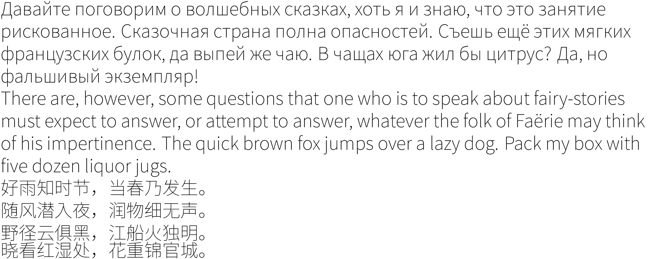
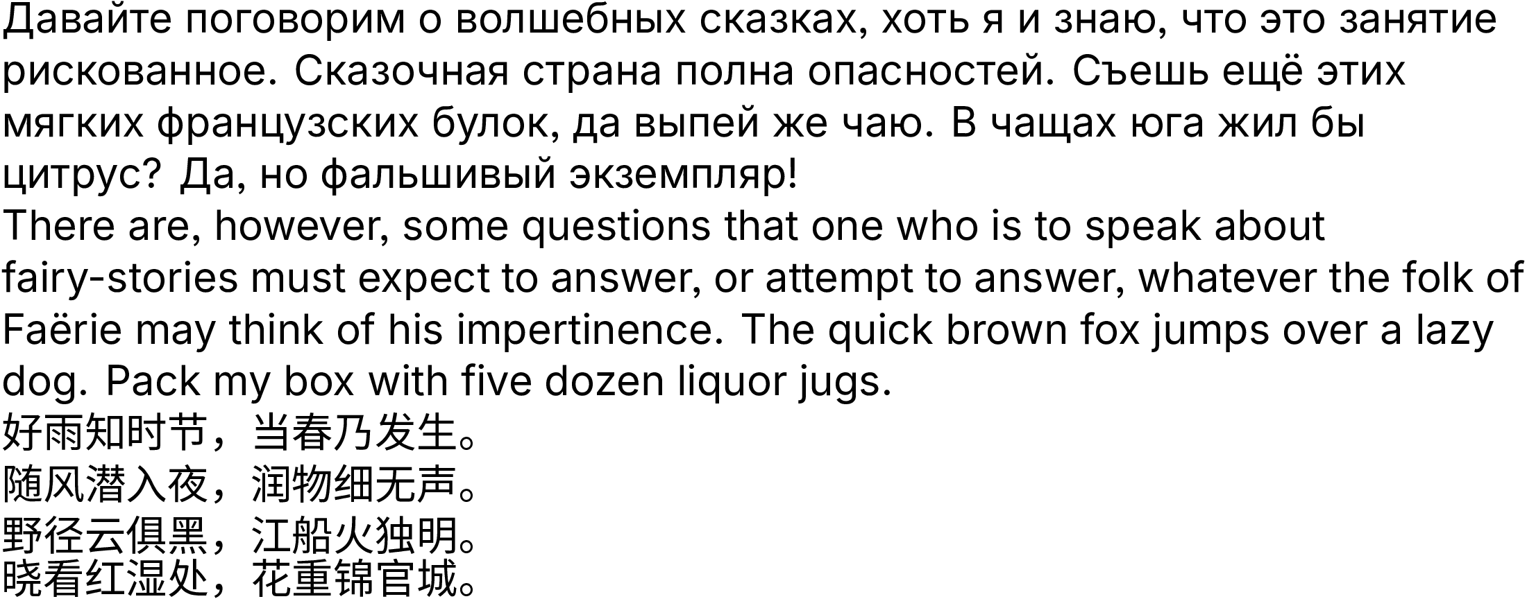
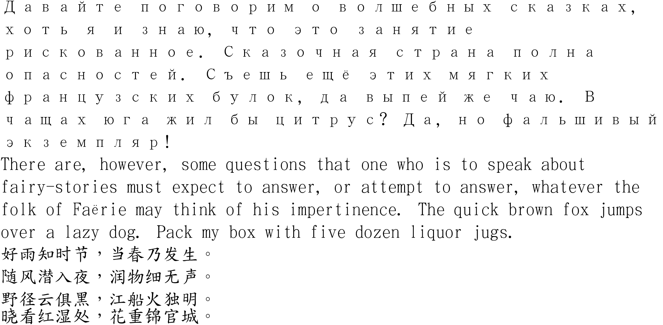
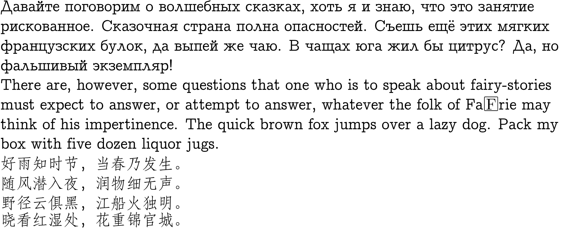
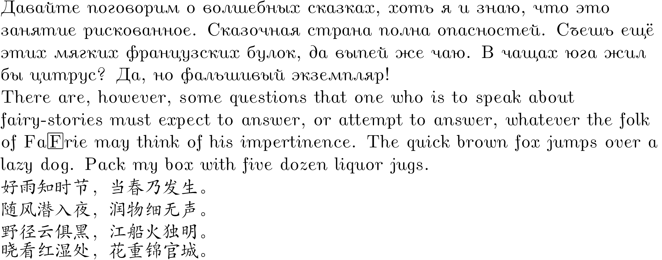
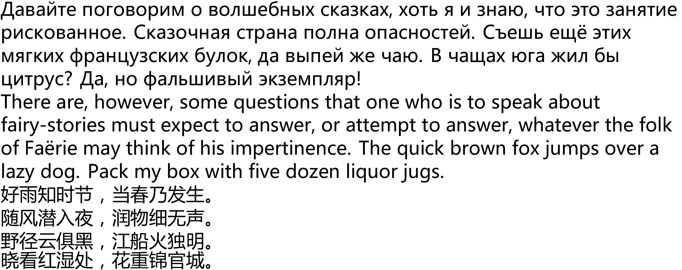
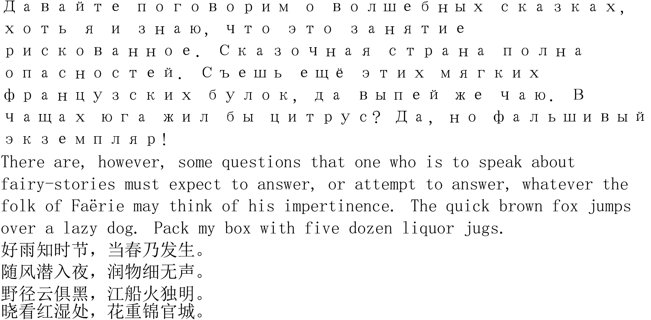
The randomly chosen font on the screenshot actually exists in an italic shape, but the list on the left shows that only 287 out of 1415 fonts available on my machine support this shape. As you have guessed "Bold Italic" is a variation which has both weight and slant changed, and this is done by hand when designing the font.
- Weight :: bold, but can also be written as a degree (Extra Light, Light, Semi-Light, Thin, Medium, Normal, Regular, Thick, Extra Thick, Semi-Bold, Bold, Ultra-Bold, Black, Heavy, Ultra-Heavy). I have NO IDEA what those mean, and no, Black is not a colour.
- Italic :: the angle of the letters with respect to the vertical axis. Can be italic or oblique, and I have not managed to spot the difference.
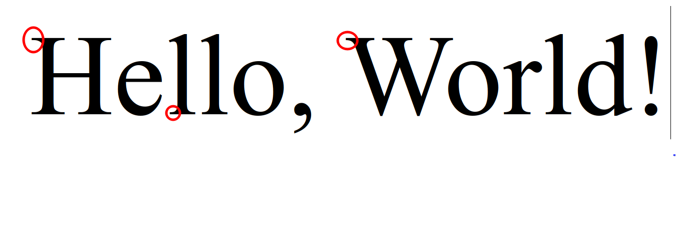
- Interline spacing :: in many text processors interline spacing can be adjusted, but most fonts do not produce characters which are strictly limited to the bounding box, and have a certain empty margin between the bounding box and the character boundary. This matters in practice.
But LibreOffice manages to give me Bold Italic characters regardless of the font! Yes, but I have NO idea how.
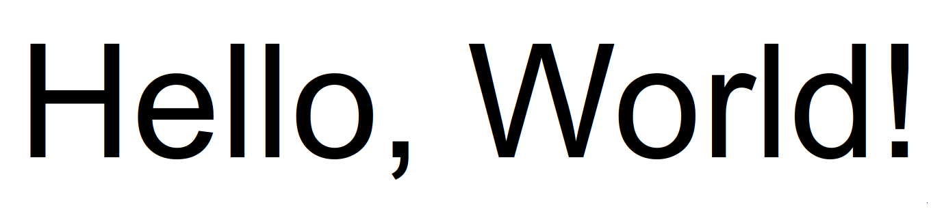
Moreover, the text rendering engine "pango" lets you explicitly select font size, without specifying the font!
<span weight="ultralight">Hello, world</span>
Emacs allows specifying font parameters inside the font name:
(set-face-font 'shr-text "Liberation Serif-30:weight=light")
I have no idea how this works. Does it transform the symbols automatically or tries to substitute something?
2.2.3. Incomplete fonts
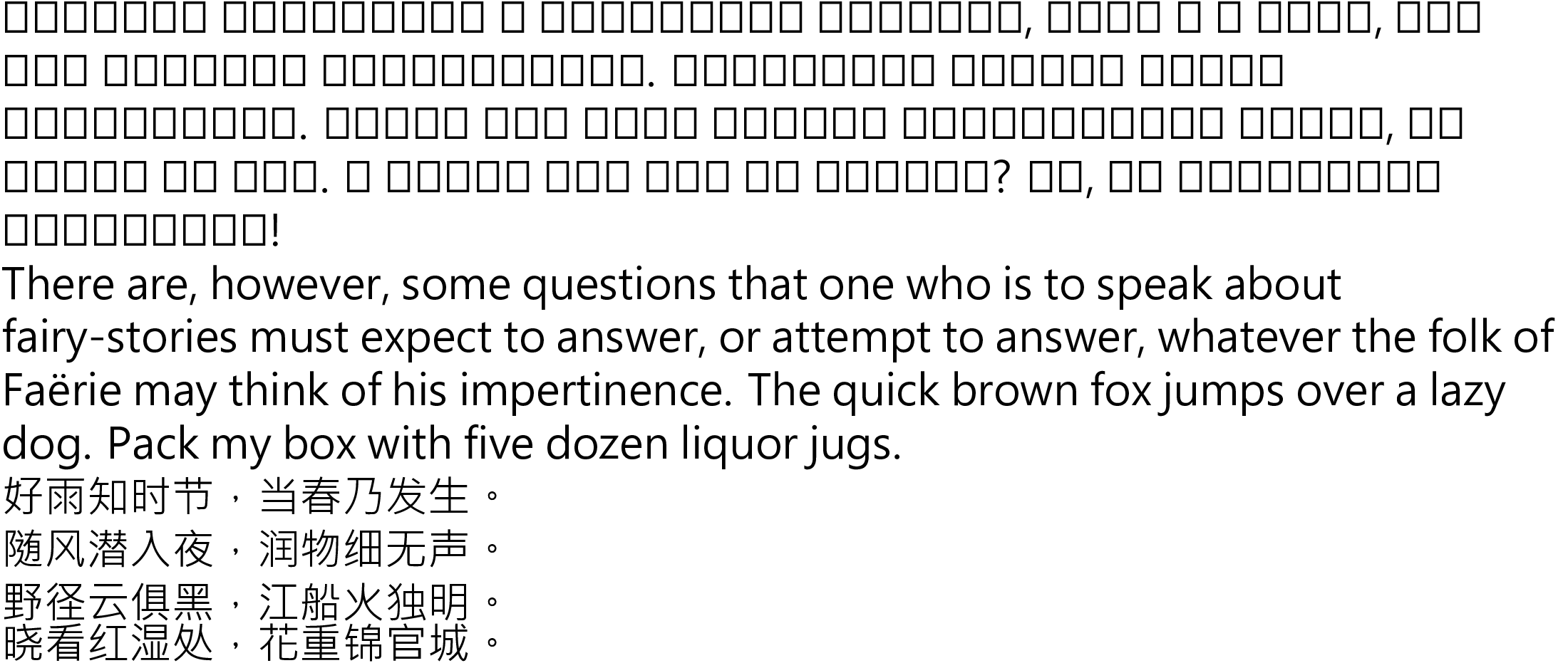
You might be baffled by this, but publishing fonts which do not cover all of Unicode is not a capital offence.
Indeed, some fonts only support Latin, and some fonts do not even support Latin!
Moreover, some fonts only support a part of a writing system.
- Versioned fonts
In the old times, a font required working with liquid metal and casting character shapes in iron. This made fonts relatively stable.
But in the time of computing, everything changes every year, and new "versions" of fonts are released. So, before lambasting your font as ugly and not supporting the characters you need, first check if you have the most recent version.
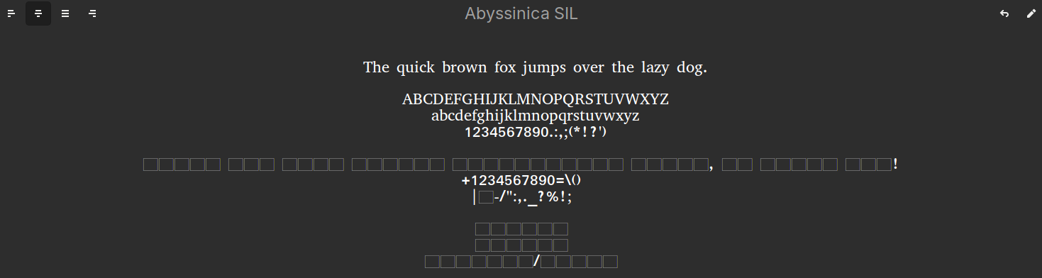
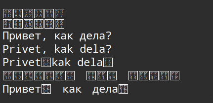
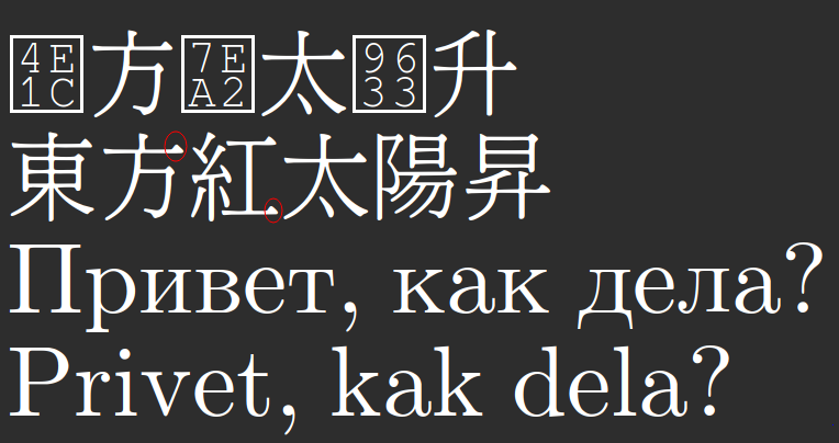
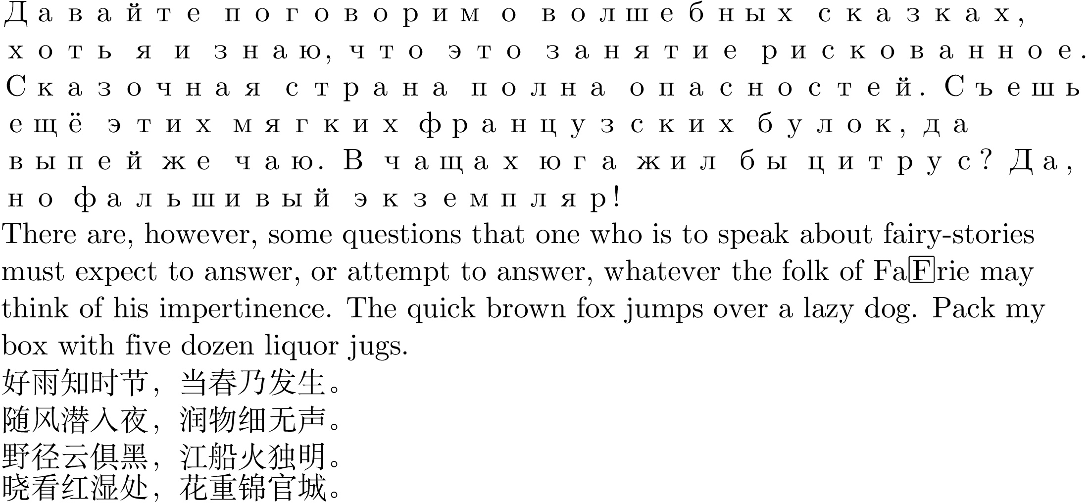
- Tofu
Tofu happens when a font does not support a character, but the program tries to behave somehow user-friendly, and at least shows the number of the character in a tiny box, so that a user can find a font with those characters present, and install it.
However, some "too user-friendly" fonts actually contain the tofu symbols inside of it. Which means that even if a program is capable of using some other font, which has all the required symbols, it wouldn't know that the current one does not support them.
This is evil, and unless you have to, do not use such fonts.
The screenshot above only has 4-tofu, but there are also 6-tofu for characters with more letters.
- White squares
This case is even more sinister. The missing characters are represented as empty boxes.
Again, I have no idea whether this is a property of the font, or the property of the rendering system, but overall it is disgusting.
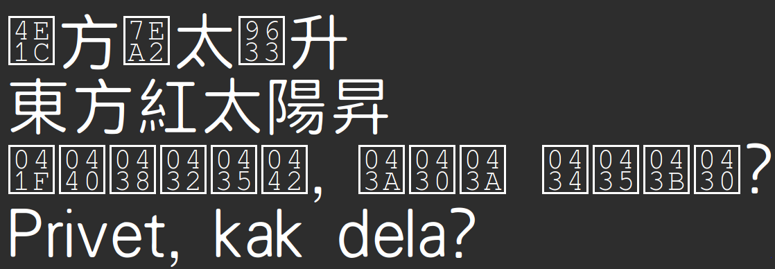
- Completely empty fonts

No, this is not a joke. The complete piece of shit called "Adobe Blank" pretends that it has all of the Unicode symbols, but in reality all of those symbols have not paint at all. You will not even know that something is written on your screen.
- Adobe Blank
- Character substitution
Some programs are clever enough to substitute missing symbols with symbols taken from another font. Microsoft Word and similar text processing suites like doing this, without even letting the typesetter choose the font from which the substituting characters are taken.
But the most amazing surprises happen when this software opaquely chooses Adobe Blank as the substitution font. Then it believes that it has substituted everything correctly, but the only thing you see is the background.
- Font set
Font sets are the true programmer's way of dealing with missing characters.
This concept expects somebody to explicitly write which character (or, rather, character group, for example "Latin Letters") should be coming from which font.
Theoretically, this solves the problem of incomplete coverage completely, except nobody in their sane mind would be writing a font set, unless he is a programmer.
Moreover, the only program using font sets which I am aware of is Emacs.
Well, TeX has some concept of using different fonts for different purposes, but it is, by itself, very hard to grasp.
- Giant disorganized fonts
Of course, nobody in their sane mind, beyond Emacs fanboys and text processor developers would care about font sets.
Most people just throw all the possible glyphs into a single font file, and call it a day. This produces files which have a colossal size, up to 100 megabytes, but modern computers are strong and are expected to withstand that.
2.2.4. Dingbats and lying fonts
- Dingbats
Dingbats are not really fonts, they just contain funny symbols in place of normal characters:
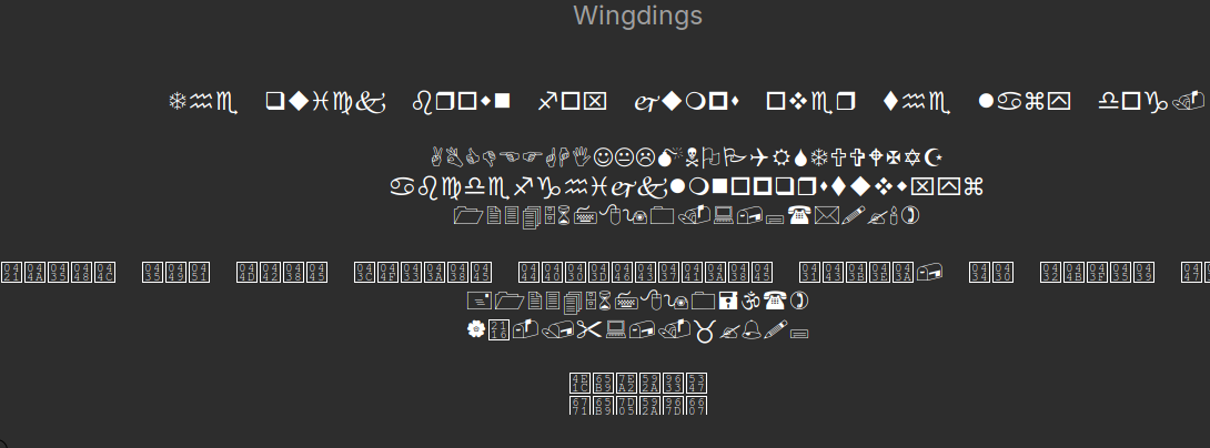
They are relatively benign, are mostly used with text processors, but do not try to write anything useful out of them. What is more important, do not try to send them instead of smileys to your friends, because they likely have a different font, and will not see the smiley copied from a dingbat font.
Dingbat fonts:
- Wingdings {1,2,3}
- Webdings
- Intentional substitutions
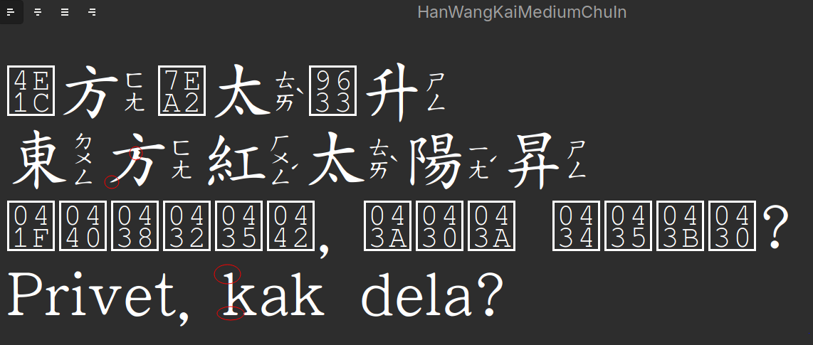
- Fake ruby-script
The font does not contain many Simplified Chinese characters, so the first line has tofu, but the second line is more interesting. The built-in shapes of the characters have phonetics (in ZhuYin) attached to them. This is not some magical trick from the rendering engine, it just has the characters drawn like this.
This is not as crazy as it sounds, if you are learning Chinese, it lets you automatically have phonetics attached, letting you read the text as if it was an Indo-European text, and it needs NO support from the program beyond the ability to switch fonts.
Well, sort of. It does not deal with characters with multiple readings, such as 行 (xíng/háng).
- Han Wang Ming Medium Chu In
- Han Wang Kai Medium Chu In
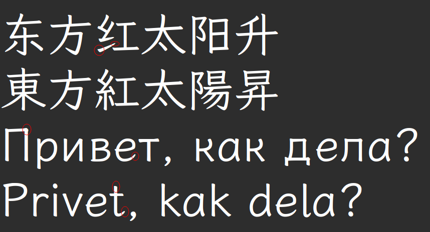
- Fake Traditional-Simplified transformations
Make no mistake, the characters didn't change from the previous section. The first line is still missing the symbols attributed to "Simplified Chinese", and the second line is still written in "Traditional Chinese". But character shapes in the second line are, in fact, from the Simplified shapes.
You can do a "poor man's" Traditional-to-Simplified conversion like this, or get horribly confused if you are doing a Chinese class online, and the program picks up the wrong font.
- HanWang Wei Bei
- HanWang Sin Song
- HanWang Kai
- HanWang FangSong
Unfortunately, I have not found a font doing the opposite conversion, Simplified-to-Traditional.
- Fake ruby-script
2.2.5. Marketing bullshit
This is an excerpt from the official website of "Google Roboto".
Roboto has a dual nature. It has a mechanical skeleton and the forms are largely geometric. At the same time, the font features friendly and open curves.
Have you understood anything? I understood nothing.
This is very typical of the font jargon to bury you in a mixture of terms and marketing.
2.2.6. Character widths
There is a big issue with character widths. It is not at all clear whether characters should all have the same width, or whether they should have a width proportional to the way they are typically written. Both conventions might be more fit for some cases and unfit for others.
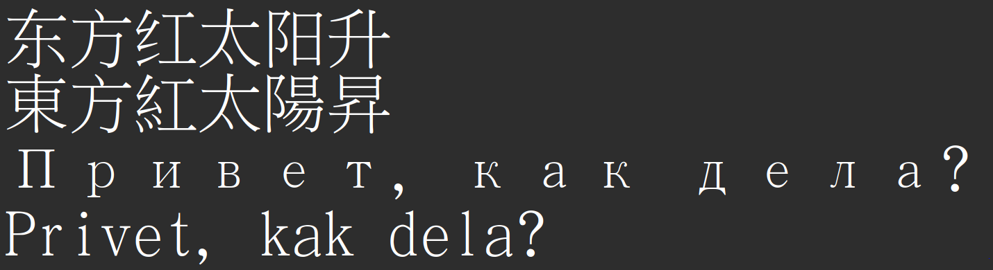
- Mono fonts
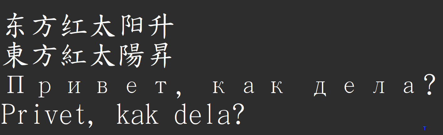
Fonts in which all characters have the same width generally look uglier, but they have a nice property: words with an identical number of characters have identical length, which makes lists automatically aligned.
Chinese fonts are naturally having identical widths, so the first two lines are aligned. Having the Cyrillic and the Latin (Translit) lines have identical lengths is also nice, even though the spaces are clearly ugly.
But the bottom two likes are funnier: you see, there are no spaces around the bottom parenthesised "Privet". The spaces are coming from the parentheses themselves, because "monospace" in the case of Latin-Chinese punctuation was solved in a bizarre way, by creating "Latin" parentheses and "Asian" parentheses, with different widths. So, Sarasa, even though it is claiming to be "monospace", that is that its characters are all of the same width, but in reality its Latin and its Han characters have different widths.
Sarasa is fairly accurate, and is solving it in the way: making Han characters twice wider than Latin ones, and keeping the whitespace a single-width Latin. However, a full-width space also exists, and full-width punctuation exists. Cyrillic does not exist in full-width, Japanese Kana and Korean Hangul exist in both sizes, but in Sarasa, half-width (Latin-sized) Hangul is rendered full-width. :(
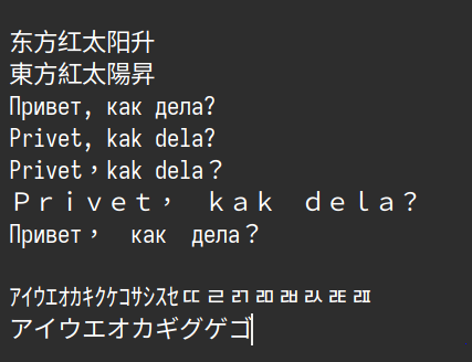
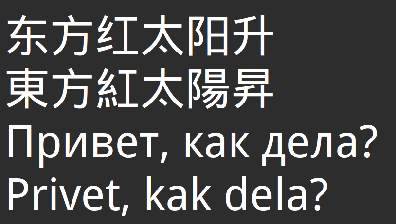
But not all fonts which claim to be monospace are actually monospace:
Noto Mono clearly does not enforce full (double) width of the tofu characters.
WenQuanYi Micro Hei Mono is not actually mono with respect to punctuation.
- Proportional fonts, kerning.
I do not like proportional fonts and I use them less than mono. However, as has already been mentioned, not all features are available for all fonts.
When I need to have a text printed in a font with "Serifs" (see the next section), I am out of choice, because I have not found a monospace font with serifs.
With proportional fonts, kerning starts to matter.
Kerning is when the system algorithmically adjusts how close together are symbols.

2.2.7. Stroke style
Some font drawing details are so prominent that we cannot avoid noticing them.
- Serifs
In particular, most Latin fonts are either Serif or Sans Serif. (Sans is French for "without".)
What are "serifs"? Serifs are those tiny marks/strokes at the ends of most of the character strokes, which are supposed to make it more readable.
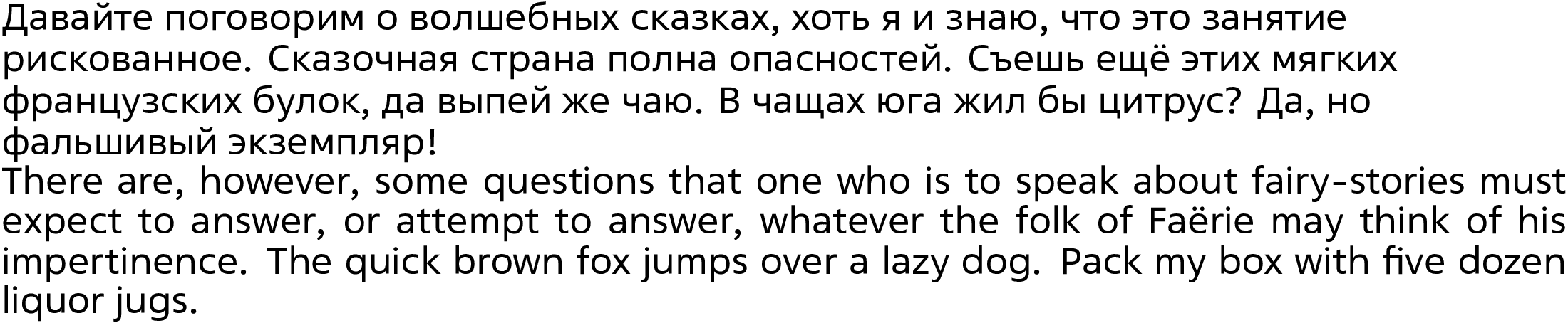
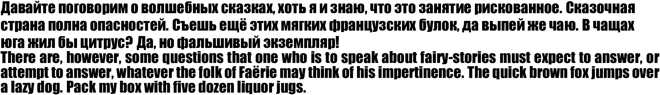
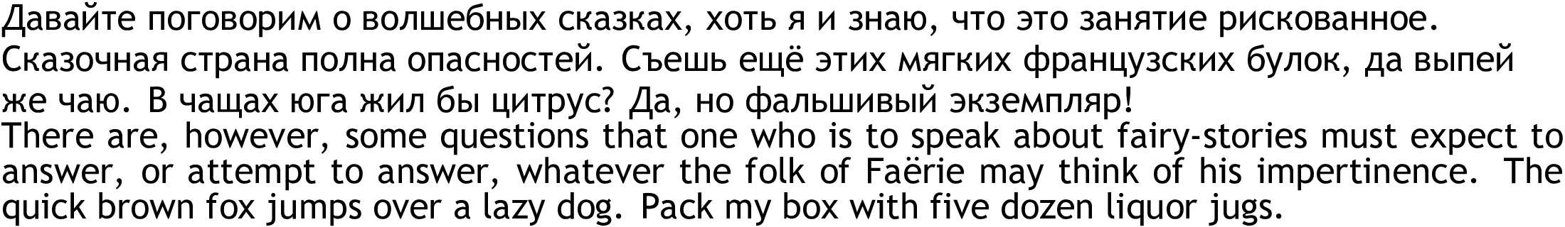
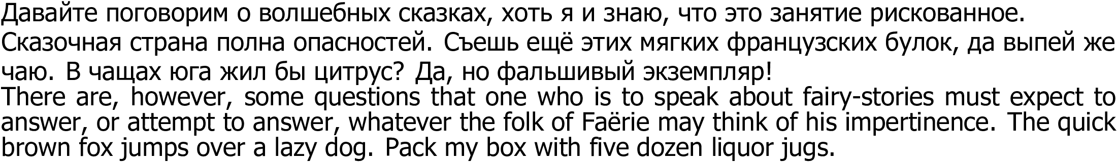
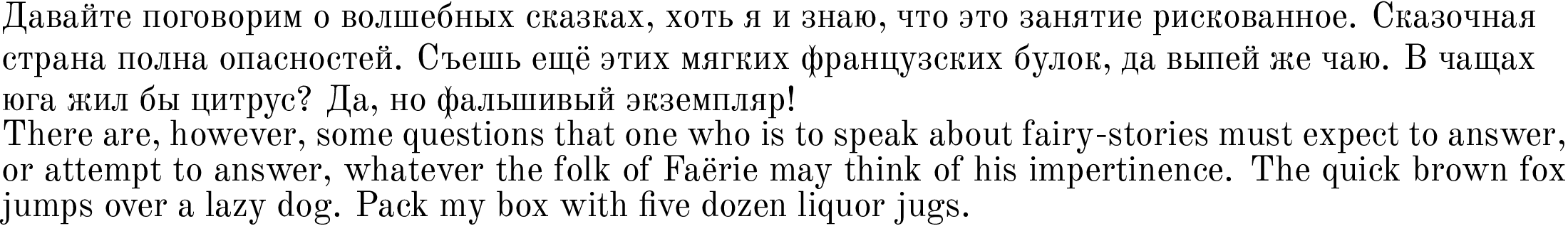
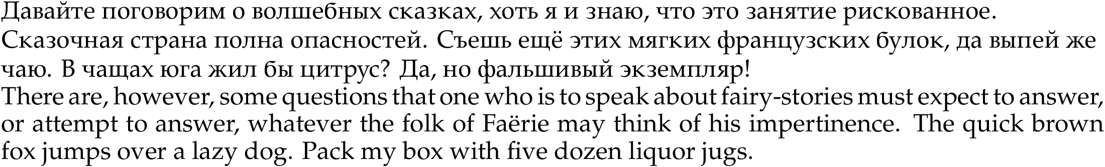
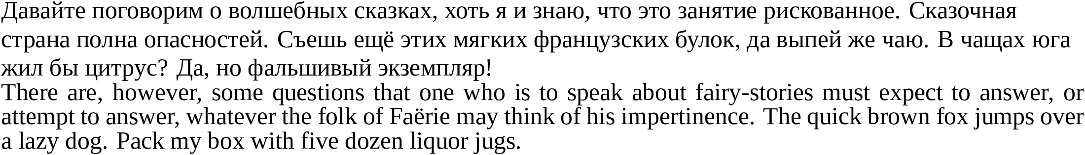
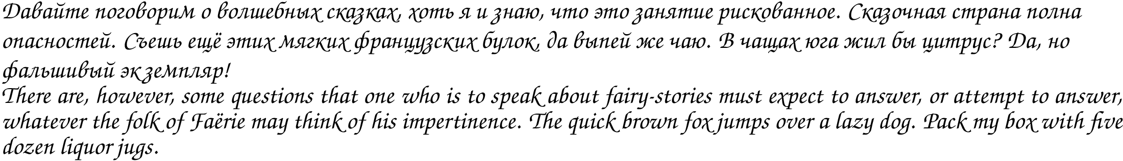
 Times New Roman has serifs.
 Arial does not have serifs.
It is believed that Sans Serif fonts are better for computer screens, and that Serif fonts are better for printed books and articles, but studies do not really support this claim. I prefer using Sans-Serif everywhere.
Slab fonts are like serif, but the serifs are not pointy, but blunt.
Standard Sarasa does not have slabs.
- Sarasa Slab has slabs for Cyrillic.
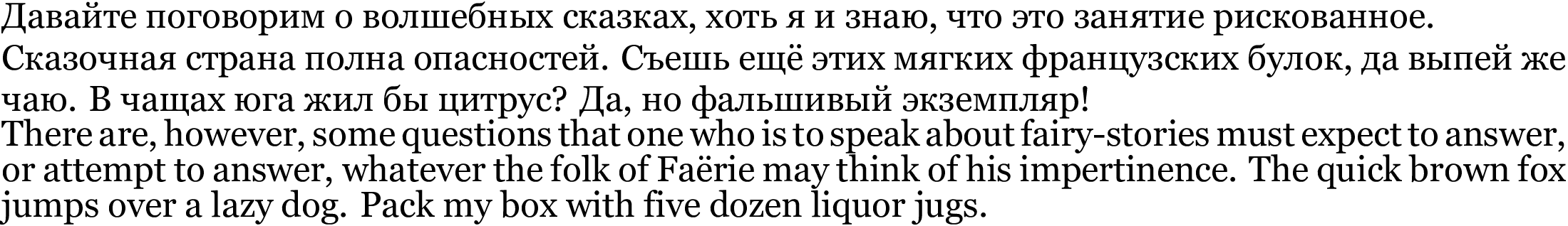
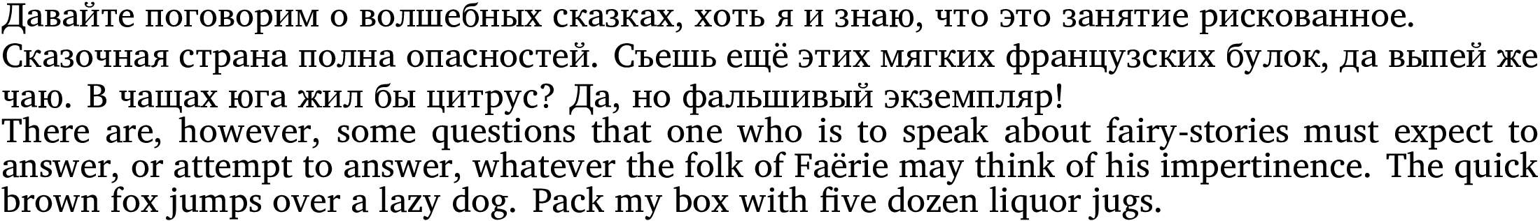
- Stroke direction
- European fonts
In Latin fonts, the issue of stroke direction only appears in fonts which imitate handwriting, and this is a seldom-happening thing.
Even for the example above, stroke direction is only really visible for "в", "т", "i".
- The font is called "Bad script".
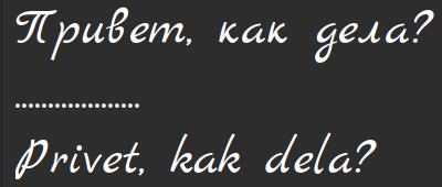
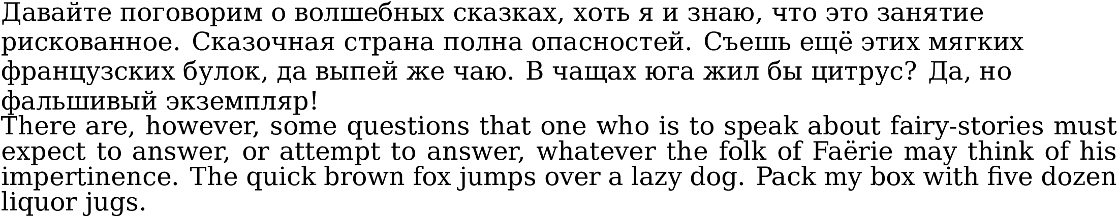
- Marck Script.
The stroke direction is more visible, but still less prominent than in Han.
But for Han fonts this is much more frequent.
- KaiTi
Kaiti (also known as KaiShu, ZhengTi, ZhengKai, ZhengShu) is a style of writing in which stroke direction is visible But make no mistake the strokes do not necessarily start thick and end pointy, often they do not.
- HanWang Kai is honestly doing its job for Han, but for Latin it just adds serifs instead of stroke ends.
- LXGW WenKai does it much more faithfully.
The Han script is clear Kai, but even Latin and Cyrillic have stroke endings marked a bit.
- TW-Kai does not even care about Cyrillic whatsoever, it seems that the Cyrillic characters are added just out of greediness.
However, the fact that Cyrillic characters are rendered as wide as Han characters, amuses me.
- MingTi-SongTi
MingTi (also called SongTi)script is like Kai in that beginnings and ends are visible, but they are marked explicitly (the marks are called "fish scales", "lín"), instead of being represented by widths.
- cwTeX Q Ming
Traditional Chinese has end marks, but Latin and Cyrillic are just serifs. But the rest of the fonts on my machine are even worse.
- TW-Sung, has at least some of Simplified Han, Traditional Han.
Serifs in Latin even look a little bit like "fish scales", but Cyrillic is just some bizarre font with Serifs, and Cyrillic letters to be "like full-width".
There is also a version of Song/Ming called FangSong, but the fonts I have which claim to implement it are inconsistent.
- Asian Gothic, HeiTi
HēiTǐ, 黑体, literally means "black body", but this "black" is unrelated to the font weight. HeiTi differes from Ming/Song/Kai in that the beginnings/ends of the strokes are not marked. Sometimes it is also called "Gothic", but this makes no sense.
They can be with square ends or rounded ends.
- WenQuanYi Micro Hei.
It has square ends. This version is proportional and tries to be faithful with Cyrillic and Latin.
- HanWang Hei has rounded endings, and also tries to be faithful to Latin, but has tofu instead of Cyrillic.
Rounded Simplified Chinese Hei Font does not exist, or I have not found it.
- European fonts
2.2.8. File formats and symbol encoding
- Rendering details
We all know that graphics can be raster and vector.
Raster images are encoded as a two-dimensional array or field or numbers, each number representing a colour. Raster images are "easy" to make for a photo camera, and for a digital artist, essentially every piece of software allows exporting into raster images.
Vector images are not even images, they are tiny (and sometimes not at all tiny) programs that "draw" an image as they are executed. In the simplest case the "program" is a mathematical function, and usually executed by a state machine not by a full-fledged Turing machine. In more malignant cases the program is executed by a true programming language.
Consequently, raster images are easy to create, but are inflexible:
- You cannot scale them, as they become distorted when enlarged.
- If the original DPI of the computer where the picture was created, does not match the DPI of the target machine, expect bad rendering.
All of that did not particularly matter in the 90s, when almost all displays had the DPI of 72 pixels per inch. I am not sure there was any agreement on that, it has just happened by itself.
But in the 2000s already things started to change. 90 dots per inch became a more prevalent resolution, and more and more often we started to see irregular resolutions: 120, 200, and all the way up to 600.
(Presumably, people do not need anything more than 600 DPI, because most printers, printing on paper, have a physical DPI of 600, and nobody complains. Scanning with a higher DPI does make sense, when you are scanning film.)
To avoid the issues with raster fonts, where each character is represented by a raster image, people started to create vector fonts. Vector fonts are better than raster in that you can scale them indefinitely, but they have a different problem: fitting mathematical functions to the display grid of pixels. You see, most functions are continuous, not discreet, and most designers who are creating vector images (tiny programs), are drawing the characters with something similar to Bezier curves (which are models of how people draw strokes), which are continuous, and know nothing about pixels and grids. If your DPI is exorbitant, this is not a problem, because a fine DPI approximates a continuous function well enough, but if the DPI is somewhere between 72 and 250, expect rendering artefacts.
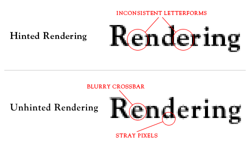
The process of bashing continuous functions into a crude grid is called "hinting". Here the word "hint" comes from the idea that you give hints to the renderer on how to behave in less-than-ideal situations.
There are two ways to "hint" – manual and automatic, so-called "auto-hinting". Hinting can also negatively affect rendering on high DPI displays.
Integer hinting is about making font strokes fit the grid of whole pixels, whereas sub-pixel hinting exploits the fact that in real life display pixels are not actually white, and consist of several smaller colourful sub-pixels (red, green, blue). Microsoft Windows "ClearType" is an algorithm of sub-pixel auto-hinting.
 Integer hinting.
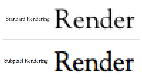 Sub-pixel hinting.
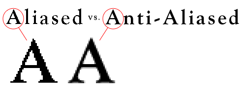
Anti-aliasing is, in some sense, one of auto-hinting algorithms, which is usually applied after normal hinting, to avoid characters having a "stairs" effect. It is not unequivocally good. Insufficient anti-aliasing makes shapes look crude, whereas excessive anti-aliasing makes them look blurry.
Having three parameters already make very hard to find a point of good-looking fonts.
- File formats
Naturally, since there are raster and vector fonts, there should be file formats for raster and vector fonts.
- BDF (.bdf) :: Raster font, black-white, not grey-scale. https://en.wikipedia.org/wiki/Glyph_Bitmap_Distribution_Format
- X11 and system storage on my machine do not have bdf fonts
- The GNU "intlfonts" package ships a lot of bdf fonts for different writing systems, seemingly, most of them pre-unicode, which means that there is a need for KOI<->Unicode translation to use them. They are most often used as a part of GNU Emacs, when system-wide fonts are not available.
- TeX 2023 is shipping bdf files as a part of the
babelbibpackage, but they are not actualbdffonts. - In short, you can forget about
bdf.
- PCF (.pcf) :: Raster font, considered to be slightly better than
bdf.- GNU intlfonts is shipping a lot of
pcffiles for Emacs. - x11 by default has quite a few
pcffonts, and they are broken into many files.
- GNU intlfonts is shipping a lot of
- PSF (.psf, .psfu, .psf.gz, .psfu.hz) PC Screen Fonts :: https://en.wikipedia.org/wiki/PC_Screen_Font
- Font used by Linux Kernel for console fonts.
- Shipped by consolefonts, kbd, psftools, and univga-font
- Unless you care about Linux console, you can forget about PSF fonts
- Type1 (.pfa (ascii), .pfb (binary)) :: Fonts that draw characters with a limited set of PostScript commands.
- Older Adobe fonts
- Fonts actively used by the TeX project, with a log of stock fonts being distributed as Type1 files.
- Type3 (.t3) :: Fonts that draw characters with a full set of PostScript commands.
- I have only ever seen TeX using Type3.
- TrueType (.ttf) :: The most popular format of vector fonts.
- OpenType (.otf) :: A newer than TrueType format of vector fonts.
- Metafont (.mf) :: A vector format for generating raster fonts, only used in TeX and not fully compatible with Type1.
The section 2.2.8.1 mentioned that fonts can be raster or vector. However, the boundary always becomes blurry, for two reasons:
- Raster fonts are often generated from vector sources, for example, with Metafont.
- Advanced vector font files (otf,ttf), may include pre-rendered, or even completely unrelated pictures for some specific sizes or shapes (usually small scales).
- BDF (.bdf) :: Raster font, black-white, not grey-scale. https://en.wikipedia.org/wiki/Glyph_Bitmap_Distribution_Format
2.3. Software tools
- Fontconfig :: Transform a "font request" into a font file and parameters.
- Freetype :: Render characters on screen on paper.
- Xft :: A library to make X11 use Freetype.
- Harfbuzz :: Some ligature-related mumbo-jumbo, but
- Font-manager :: A powerful font browser, in some respects better than gucharmap. https://github.com/FontManager/font-manager .
- Gucharmap :: A GUI for fonts and characters browsing.
- Fontforge :: A font-creation multi-tool.
- xgridfit :: A tool to write hinting scripts for fonts.
- Metafont :: A TeX-related tool to create fonts programmatically.
- Fontaine :: https://www.unifont.org/fontaine/
- xlsfonts :: lists fonts available from an X server.
2.3.1. fontconfig
Fontconfig contains utilities for working with font files and properties. It is most often used for translating a font "request", written in an ill-defined format, into a file name and, possibly, a few variation indications, allowing to choose a font from within a file (if a file contains several fonts).
fc-query <filename> will list font details found in the file.
fc-match <Font Name> will show file name where a font will be loaded.
You can actually feed a kinds of weird crap there:
fc-match badgfsafsdfds
fc-pattern <request> will show how the request is parsed.
fc-list shows installed fonts.
fc-configlist will show parameters from /etc/fonts/.
fc-scan will parse all font files from a directory.
fc-list has a nice way to display only fonts which have certain characters.
fc-query prints a lot of useful information about a font, in particular, it lists sub-fonts in a big file with many fonts, it is extremely useful.
fc-cache caches font info, run it after installing each font.
2.3.2. xlsfonts
xlsfonts lists fonts.
mkfontdir creates font cache files (fonts.dir) in font directories.
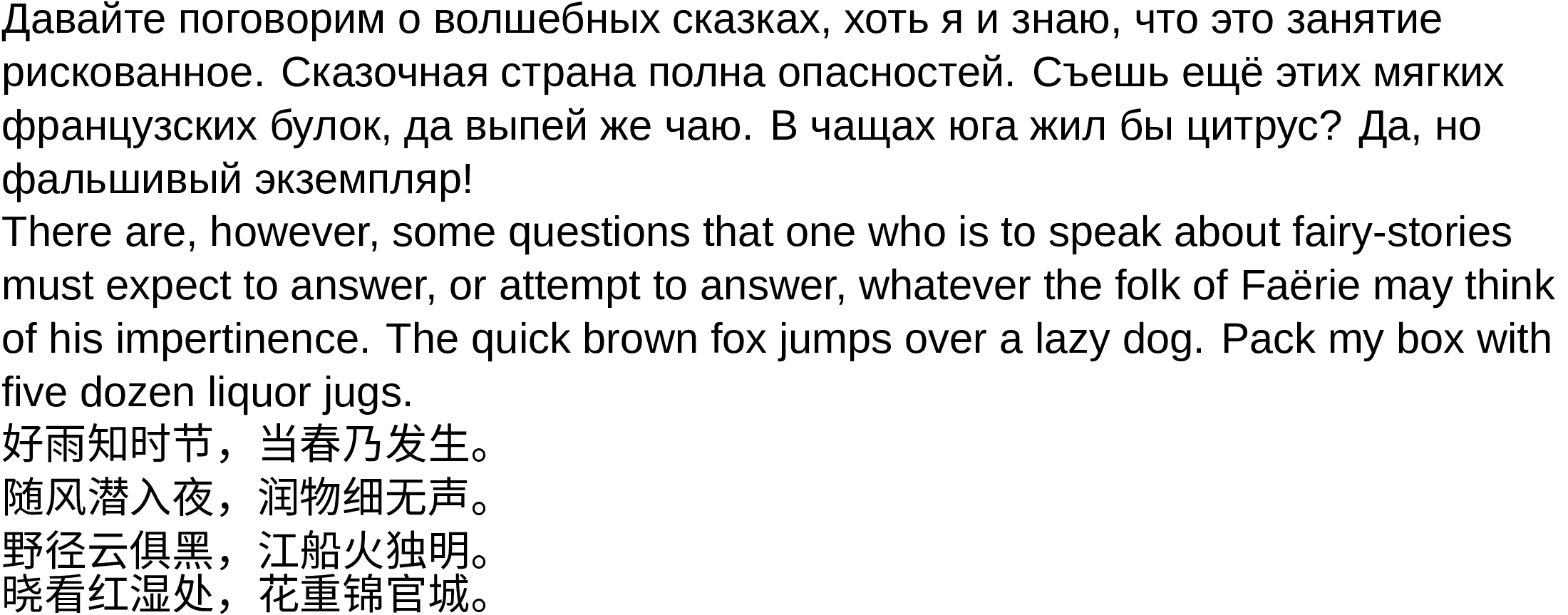
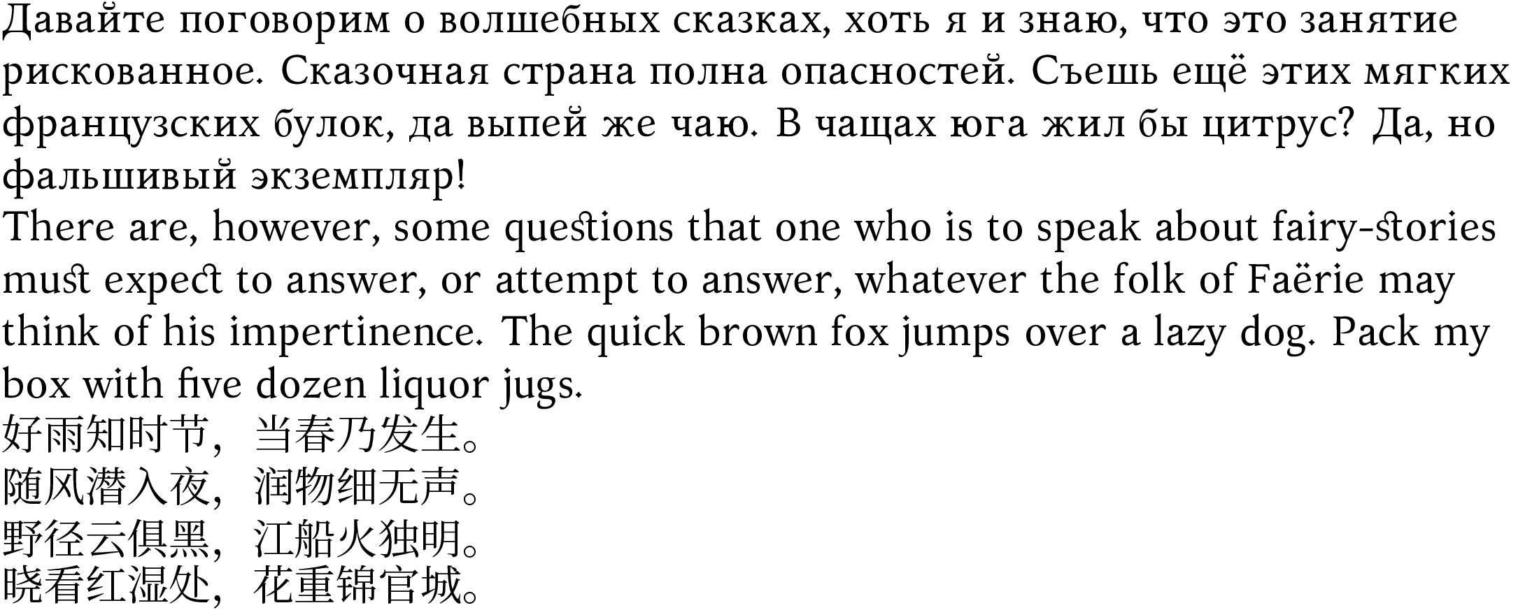
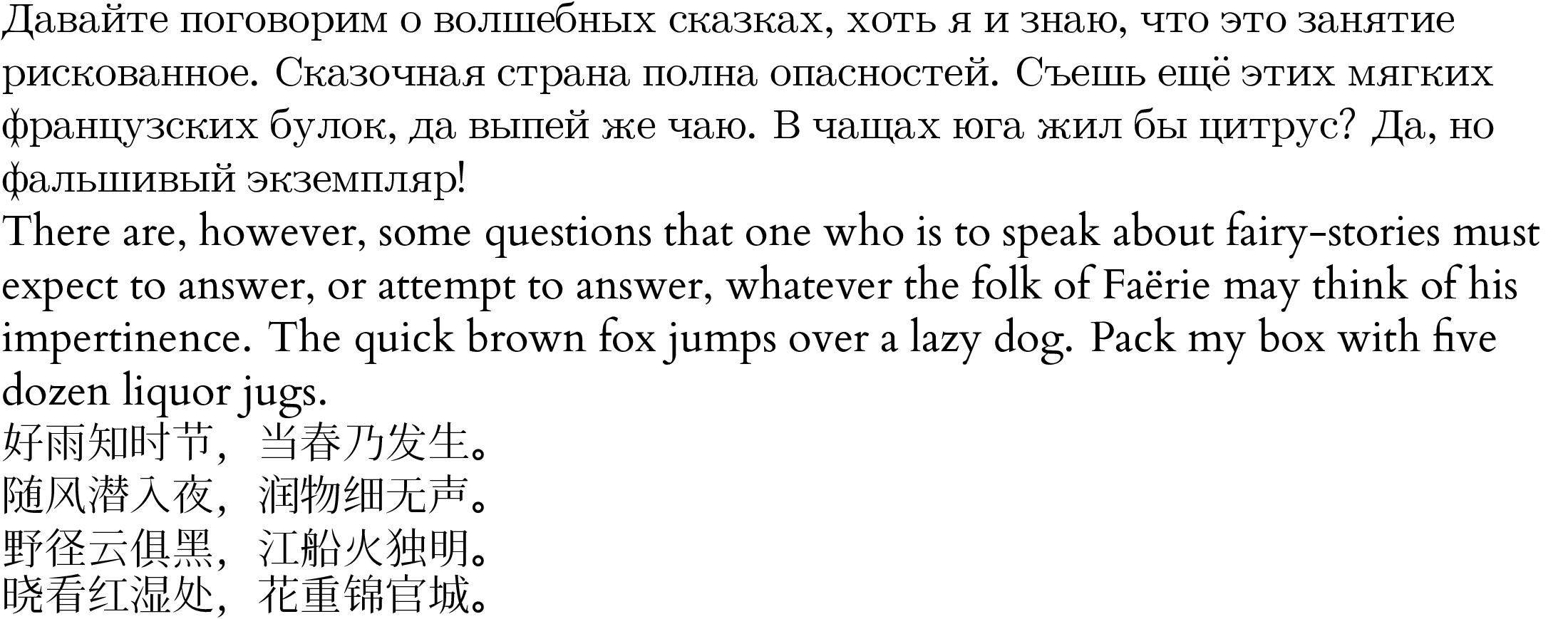
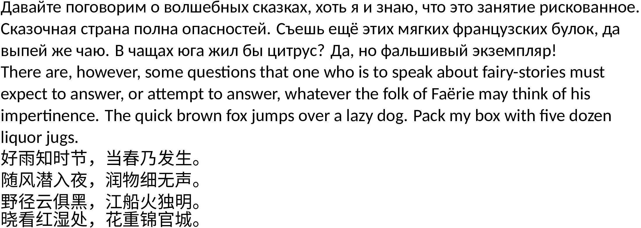
3. The safest font choice for minimal thinking.
fc-list has a nice way to display only fonts which have certain characters:
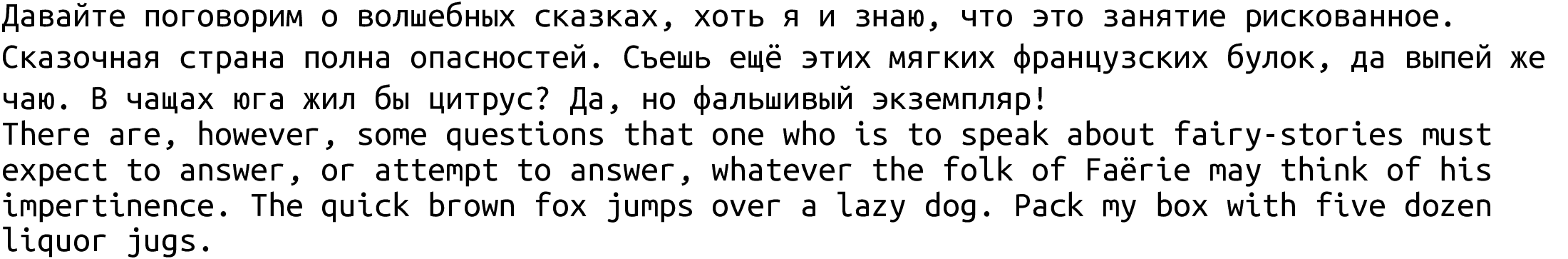
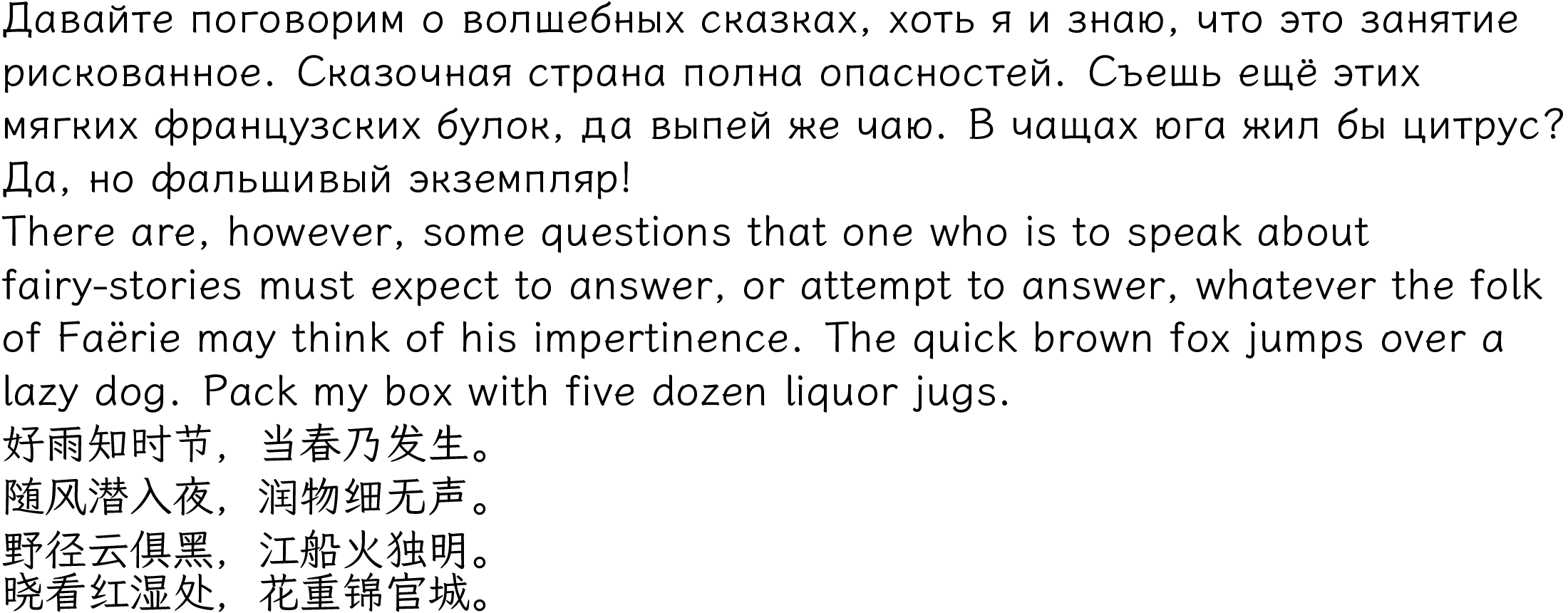
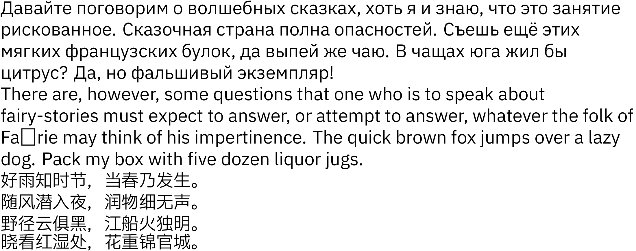
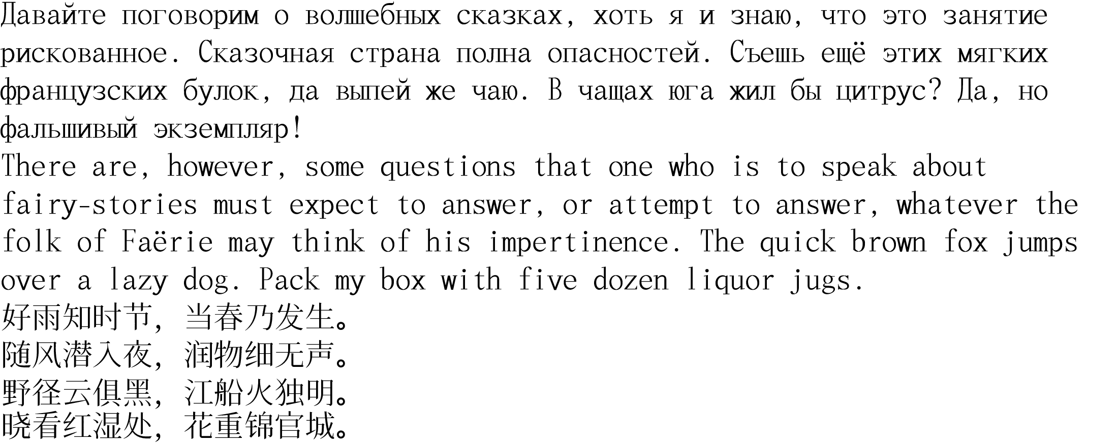
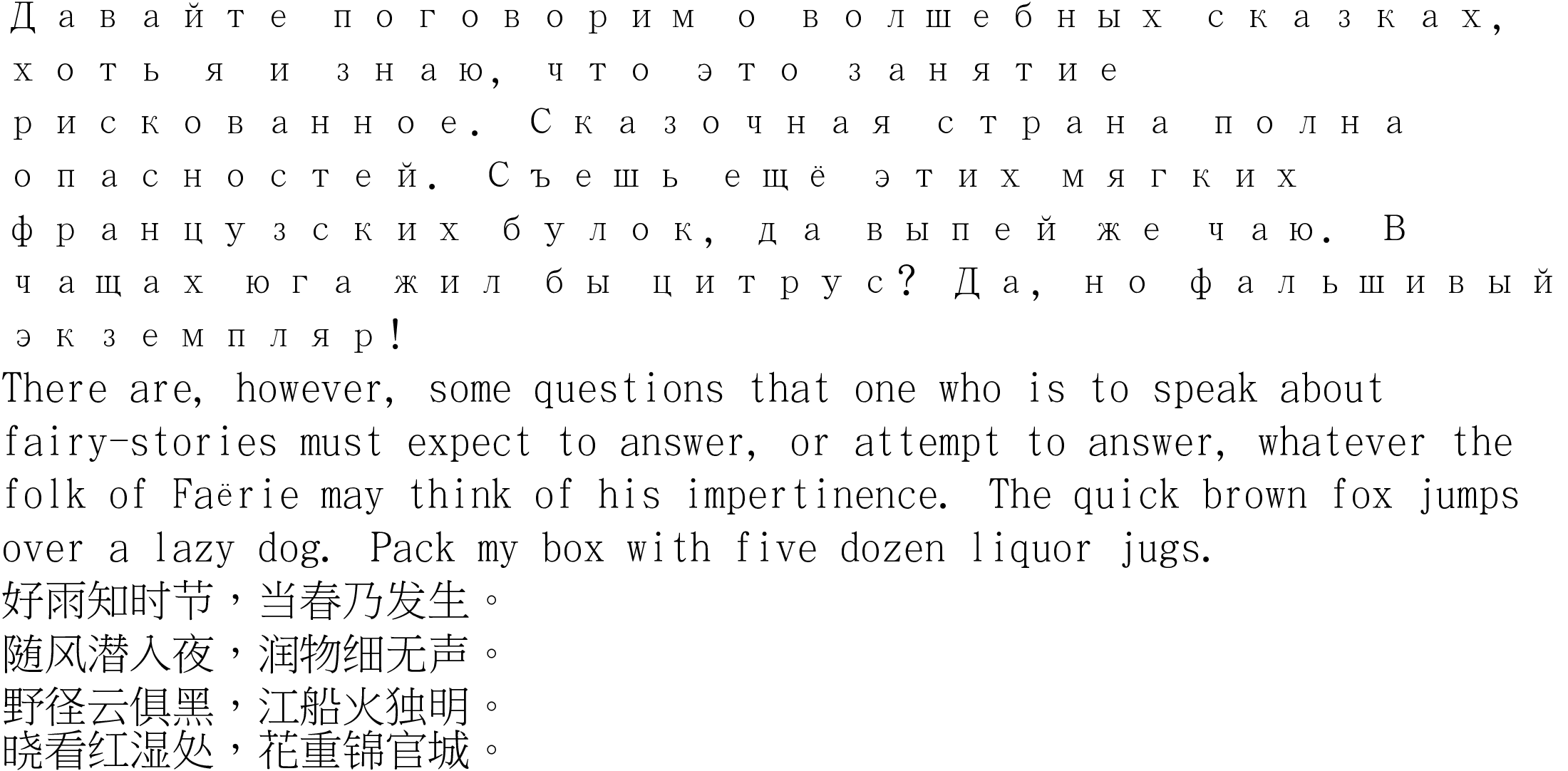
characters="abcdefghijklomnopqrstyvwABCDEFGHIJKLOMNOPQRSTYVWабвгдеёжзиклмнопрстуфхцчшщъыьэюя甲乙丙丁機會東紅东方红太阳升"
request_string=""
for (( i=0; i<${#characters}; i++ )); do
  char=${characters:i:1}
  request_string="${request_string}"$(printf '%x' \'"$char")","
done
fc-list ":charset=$request_string" | awk '{print $1;}' | sort -V | uniq | grep -v -E '(Bold|Light|Medium|Thin)'
Ignoring the variations, it seems that the variety of available fonts is very small:
- Unifont :: Bitmap and ugly
- IBM Plex Sans :: Propotional, Sans, Hei-Square
- Hanazono :: Mono, Serif, Ming
- LXGW WenKai :: Proportion, Sans-Ming, Kai
- LXGW WenKai Mono :: Mono, Sans-Ming, Kai
- Google Noto Sans CJK :: Proportiondal, Sans, Hei-Square
- Google Noto Sans Mono CJK :: Lying Proportional, Sans, Hei-Square
- Google Noto Serif :: Proportional, Serif, Ming
- Sarasa Gothic :: Proportional, Sans, Hei-Square
- Sarasa Mono :: Mono, Sans, Hei-Square
- Sarasa Mono Slab :: Mono, Slab-Serif, Hei-Square
- Adobe Source Han Sans :: Lying Proportional, Sans, Hei-Squared
- TW Kai :: Proportional, Serif, Kai, Full-width Cyrillic (ugly)
- TW Sung :: Proportional, Serif, Ming, Full-width Cyrillic (ugly)
- WenQuanYi Micro Hei :: Proportional, Sans, Hei-Square, broken Korean
- WenQuanYi Micro Hei Mono :: Mono, Sans, Hei-Square
- WenQuanYi Zen Hei :: Proportional, Sans, Hei-Square
- WenQuanYi Zen Hei Mono :: Lying Proportional, Sans, Hei-Square
- Kurinto TMod (Times) :: Proportional, Serif
- Kurinto Seri :: Proportional, Sans, Hei
- Kurinto Book :: Proprtional, Sans, Ming
- Kurinto Arte :: Proportional, Serif, Ming
- Kurinto Mono :: Mono, Sans, Hei
- Kurinto Cali :: Proportional, Sans, Hei
- Kurinto Text :: Proportional, Serif, Ming
With respect to "looking differently" and being practical:
- Hanazono :: Ming+Serif
- LXGW :: Kai+Sans
- Plex
- Noto :: Ming+Serif
- Sarasa :: Hei+Sans
- Source :: Hei+Sans
- WenQuanYi Micro :: Hei+Sans (broken Korean)
- WenQuanyi Zen :: Hei+Sans (a bit ugly)
- Kurinto :: I discovered it later. Seems a decent choice.
Of those, most look almost identical. (There was some governmental project to standardise Simplified character shapes, most fonts come from there.)
For printing, Kai+Sans looks okay, and thus LXGW wins. For displays, Hei+Sans is a win, and Sarasa wins. Sarasa has Hei+Slab-Serif, but it is mono, print with it, if you dare, it's not too bad, just spaces are a bit wide.
The choices Hei+Serif and Hei-Round are nonexistent. :(
Check for Kurinto again.
3.1. Target software
- LibreOffice
- TeX
- Firefox
- Emacs
- X11/Fontconfig
LibreOffice, Firefox, Emacs, and Fontconfig can use system-wide fonts in /usr/share/fonts.
LibreOffice does not support Type1 fonts.
Emacs can also use its own fonts.
TeX can use system-wide fonts if called via LuaLaTeX.
\usepackage{fontspec}
\begin{document}
{ \setmainfont{URWGothic-Book.otf}[Path=/usr/share/fonts/OTF/] Your Text! }
\end{document}
4. Different font projects
Even though the following projects claim to be making fonts, they are not making fonts in conventional sense. They are rewriting the same fonts using different generating methods, and often "improving" them.
- Knuth and Computer Modern
- GUST :: TeX Gyre (https://www.gust.org.pl/projects/e-foundry/tex-gyre) and Latin Modern
- STIX :: https://en.wikipedia.org/wiki/STIX_Fonts_project
- Sarasa :: https://picaq.github.io/sarasa/
- Microsoft Webcore Fonts
- Microsoft Asian Fonts Pack
- Droid
- Roboto
- Noto
- ParaType PT Fonts
- Adobe Source
- Adobe PostScript Type 1 Fonts
- Liberation
- RedHat Liberation
- Libertine
- Libertinus
- Liberastika
- Firefox OS (Fira Sans)
- Gnome Cantarell
- ChromeOS Core Fonts
- Ubuntu
- EB (Garamond)
- DejaVu
- URW
- Bitstream (Vera+Charter)
- Kurinto :: https://kurinto.com/
- GNU FreeFont
- Hanazono
- BabelStone
- Iosevka
- ShangGu :: https://github.com/GuiWonder/Shanggu
- Terminus
- LOCALFONTS
5. Fonts for work
Most of these fonts only support Latin, some support Cyrillic, and only, if any, a few support Han.
Here is the list of commonly encountered fonts:
- AvantGarde :: Sans, Latin-only
- MS Century Gothic
- TeX Gyre Adventor :: No Cyrillic
- URW Gothic L :: Has Cyrillic
- Bauer Futura
- Bookman :: Serif
- URW Bookman :: Has Cyrillic
- TeX Gyre Bonum :: No Cyrillic
- Courier :: Slab-Serif, Mono
- Microsoft Courier New
- FreeMono :: Has Cyrillic
- URW++ Nimbus Mono L :: Has Cyrillic
- TeX Gyre Cursor :: No Cyrillic
- ChromeOS Crosscore Cousine :: Sans, compatible, actually very different
- PT Mono :: Compatible but actually very different, Has Cyrillic
- Kurinto CMod :: Sans
- Kurinto CNew :: Slab-Serif
- Helvetica/Arial :: Sans , default font in Windows 3-ME
- Microsoft Arial (almost)
- ChromeOS Crosscore Arimo
- FreeSans
- URW++ Nimbus Sans L :: Has Cyrillic
- Tex Gyre Heros :: No Cyrillic
- MS Sans Serif
- Google Android Roboto (old)
- Kurinto Aria
- Century Schoolbook :: Serif
- MS Century
- Tex Gyre Schola :: No Cyrillic
- Old Standard :: Has Cyrillic, minor variations
- URW C059
- Palatino :: Serif
- MS Palatino Linotype
- URW Palladio (P052) :: Has Cyrillic
- TeX Gyre Pagella :: No Cyrillic
- MS Book Antiqua :: Has Cyrillic
- Domitian
- Times New Roman :: Serif
- Liberation Serif
- Linux Libertine Serif
- Libertinus Serif
- Localfonts Common-Serif
- ChromeOS Crosscore Tinos
- FreeSerif
- URW++ Nimbus Roman No. 9 L
- STIX
- XITS
- TeX Gyre Termes :: No Cyrillic
- PT Astra Serif
- PT Astra Sans :: compatible
- Kurinto TMod
- Kurinto TRom
- ZapfChancery :: Serif
- TeX Gyre Chorus :: No Cyrillic
- URW Chancery L (Z003) :: Has Cyrillic
- Monotype Corsiva
- Optima :: Sans
- Linux Biolinum
- Libertinus Sans
- Liberastika
- Andale Mono/Sans :: Sans
- Droid Sans Mono
- Webcore Andale Mono
- MS Georgia :: Serif
- Webcore Georgia
- Kurinto Grga
- MS Verdana :: Sans
- Bitstream Vera Sans
- DejaVu Sans
- PT Astra Fact
- Webcore Verdana
- Impact :: Sans, Heavy
- Webcore Impact
- MS Trebuchet :: Sans, default font in Windows XP
- Webcore Trebuchet
- MS Tahoma :: Sans, default font in Window 2000, 2003
- Wine Tahoma
- Webcore Tahoma
- Lucida Console :: Sans, Mono
- MS Consolas (slightly different i, l, g)
- Inconsolata
- Computer Modern typewriter
- Bitstream Vera Sans Mono :: No Cyrillic
- Lucida Sans/Lucida Grande :: Sans
- Webcore Lucida Sans Unicode
- Frutiger Univers :: Sans
- URW Classic Sans
- MS Corbel :: Has Cyrillic
- Bitstream Vera Sans :: No Cyrillic
- Bera Sans :: No Cyrillic
- MS Segoe UI :: Sans, default font in Windows 7,8,2008 (technically different)
- MS Selawik (technically different)
- MS YaHei (Chinese)
- Open Sans
- Bitstream Vera Serif :: Serif
- DejaVu Serif :: Has Cyrillic
- TeX Bera Serif :: No Cyrillic
- arev
- Bitstream Charter :: Slab-Serif
- Charis SIL
- Gentium Plus :: Serif
- MS Calibri :: Sans, default font in MS Office > 2007
- Google Carlito
- Lato
- Computer Modern Unicode Sans
- Kurinto Cali
- MS Cambria :: Serif
- Google Chrome Caladea
- Kurinto Bria
- [missing] Janson :: Serif, Random House font
- <Available implementation missing>
- Franklin :: Sans
- Libre Franklin :: Has Cyrillic
- Knuth Computer Modern :: Serif, Default TeX font
- CMU (Computer Modern Unicode)
- GUST Latin Modern
- New Computer Modern
- ML Modern
- CM-Super
- Clarendon :: Slab-Serif, Wild-West poster font
- Montagu Slab :: No Cyrillic
- Libre Clarendon :: ?
- Kurinto Roma
- Ubuntu :: Sans, default Ubuntu font after 10.10
- Ubuntu Titling :: Sans, default Ubuntu before 10.10
- Cantarell :: Sans, default GNOME 3.0-47
- Cambay
- Petra Sans
- Inter :: Sans
- Adwaita Sans :: default GNOME 48
- Apple San Francisco :: default MacOS 2015+
- New Roboto
- Fira :: Sans, default Firefox OS, Iceland government, Deutsche Post
- FF Meta
- Noto Sans :: Sans
- Droid Sans :: Sans, early Android, "low-resolution" font
- Noto Serif :: Serif
- Droid Serif
- PT Sans :: Sans
- PT Serif :: Serif
- Garamond :: Serif
- EB Garamond
- TeX garamondx
- Adobe Garamond
- Monotype Garamond
- URW++ Garamond No. 8 :: APL
- Apple Garamond :: No Cyrillic
- Cormorant
- Kurinto Gara
- Baskerville :: Serif
- Baskervville :: No Cyrillic
- Libre Baskerville :: No Cyrillic
- Baskerville PT :: Proprietary
- TeX Baskervaldx :: TeX only
- Cyrillic Version unavailable
- Utopia :: Serif
- TeX Heuristica :: No Cyrillic
- Linguistics Pro :: Has Cyrillic
- Localfonts Ezerovo :: Has Cyrillic
- Sarasa Gothic :: Sans
- Iosevka :: Has Cyrillic
- Sarasa Slab :: Slab-Serif
- Iosevka Slab/Iosevka Etoile :: Has Cyrillic
- Terminus :: Sans, Mono
- ax86 Terminus raster
- Terminalia vector :: Has Cyrillic
- [not demoed] Swiss Type :: Sans
- Localfonts Common-Sans
- Google Literata :: Serif (specially for ebooks)
In total it is 44 fonts that anybody realistically has a chance of seeing. Frankly speaking, Sarasa is an obscure font, I have added it here for the sole reason of my personal affinity.
5.1. Sans
5.2. Serif


5.3. Terminal


6. Fonts with Han
I am not qualified enough to find out which Chinese fonts are equivalent to which, so I will just write down them all. In real life you would be only choosing from among these fonts, because it is the safest choice.
6.1. LXGW WenKai
6.2. IBM Plex Sans
6.3. GNU Unifont

6.4. Hanazono
6.5. Kurinto Aria
6.6. Kurinto Arte
6.7. Kurinto Book
6.8. Kurinto Cali
6.9. Kurinto Mono
6.10. Kurinto Sans
6.11. Kurinto Seri
6.12. Kurinto TMod
6.13. Kurinto Text
6.14. Noto Sans CJK
6.15. Noto Serif CJK


6.18. CNS11643 TW Kai
6.19. CNS11643 TW Sung
6.20. WenQuanYi Micro Hei
6.21. WenQuanYi Zen Hei
6.22. Fandol Hei

6.23. Fandol Song
Fandol Song works if you only have a TeX installation, and quickly need to have something done, and do not need diacritics.
6.24. Fandol Fang (fangsong)
6.25. Fandol Kai
6.26. Microsoft YaHei
6.27. Microsoft SimSun
6.28. Microsoft MingLiu
6.29. Microsoft DengXian
6.30. Microsoft JhengHei (正黑)
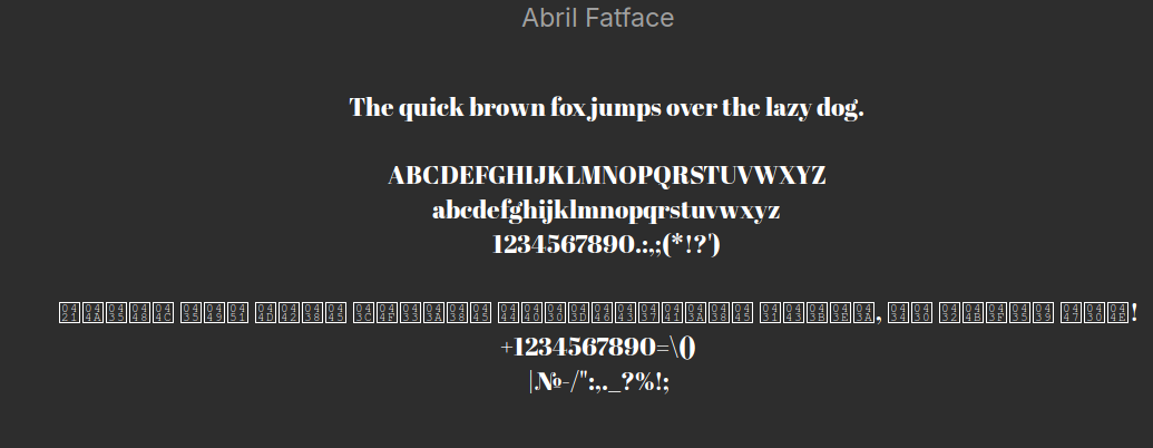
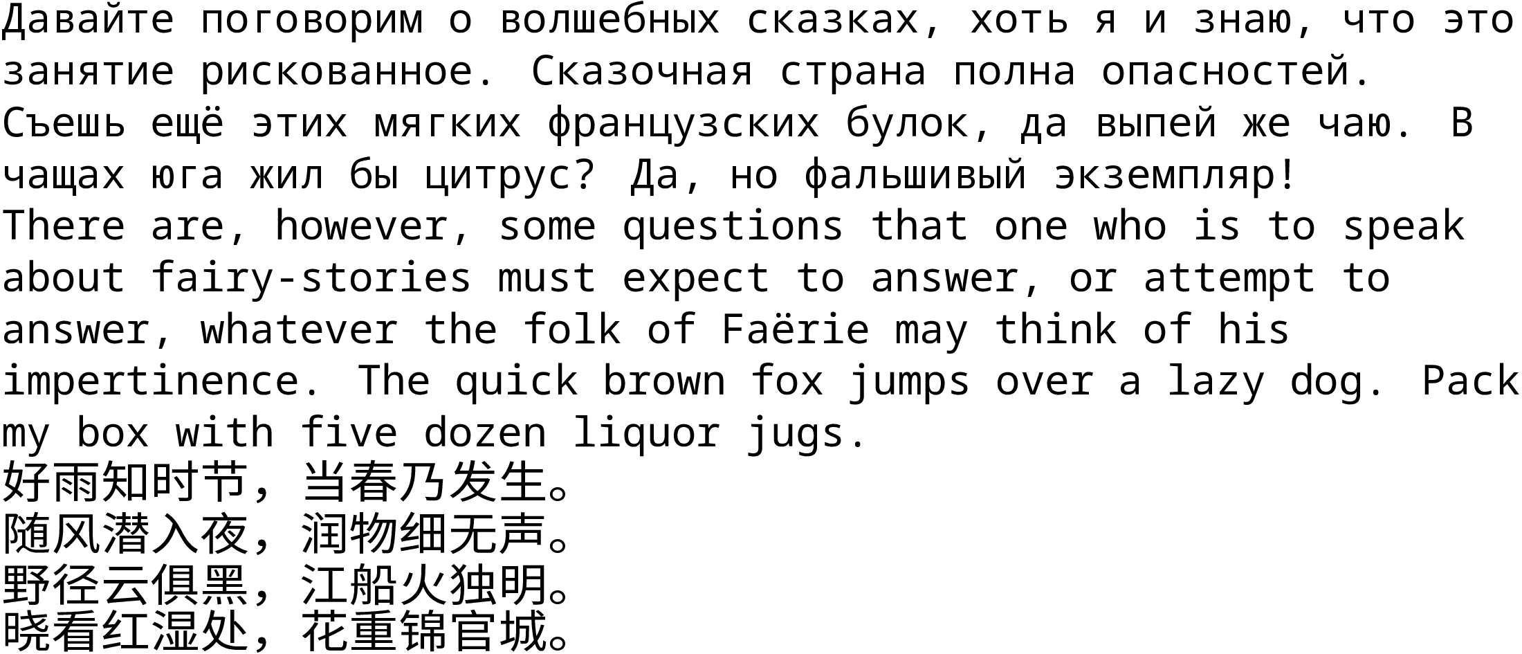
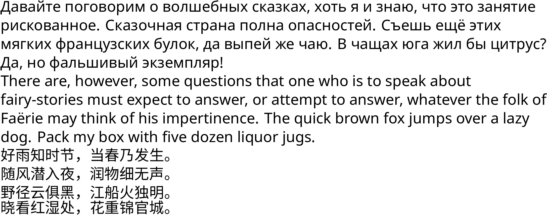
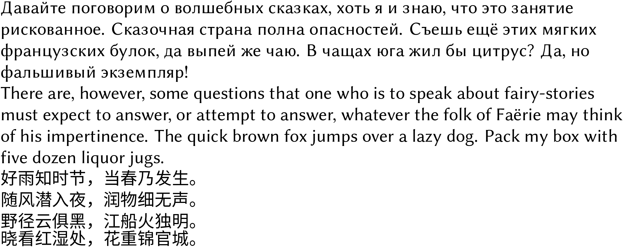
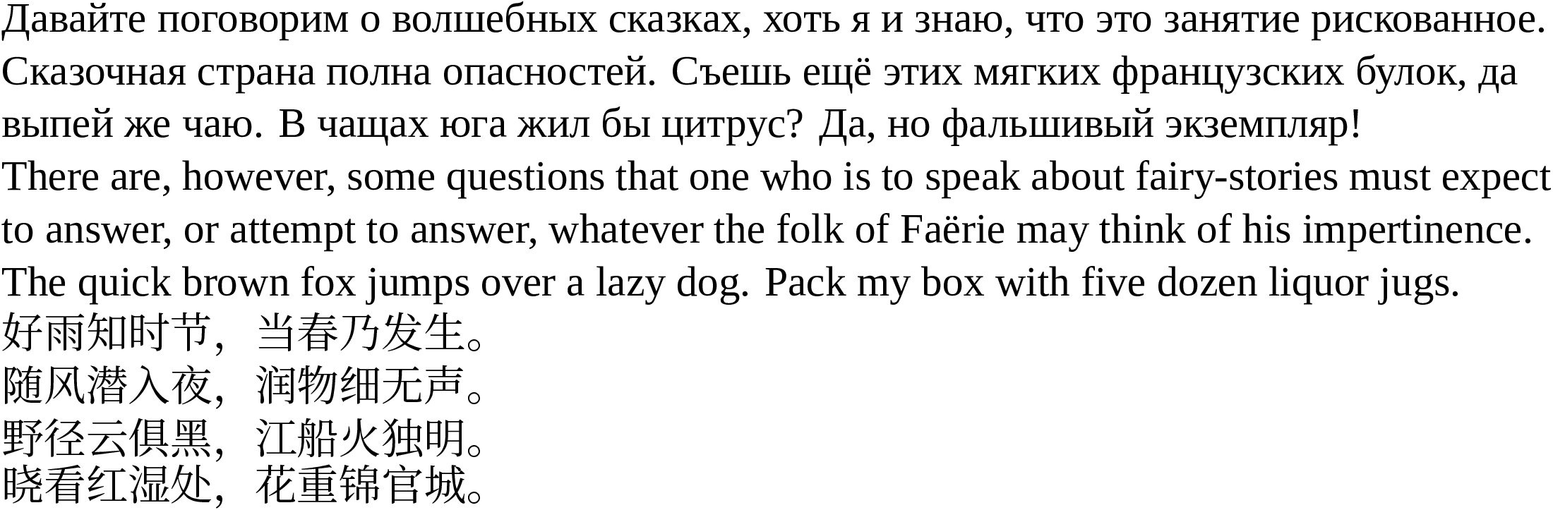
7. Fonts for fun
- Misc Fixed, X11, XFree86
- VGA/DOS
- oldschools fonts collection
- MS Comic Sans
- Webcore Comic Sans
- Script/Bad Script
- Google Bad Script
- Zapfino
- Blackletter
- Fraktur
- Kurinto Olde
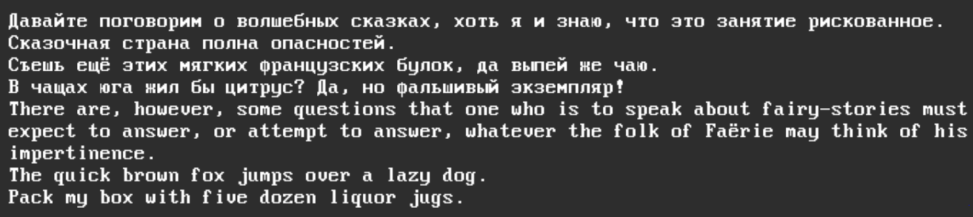
7.1. Misc Fixed
This is the default font of X11, XFree86, X.Org.
I have not found how to load an otb file in LuaLaTeX, message me if you have.
7.2. univga VGA
Standard VGA and DOS font.
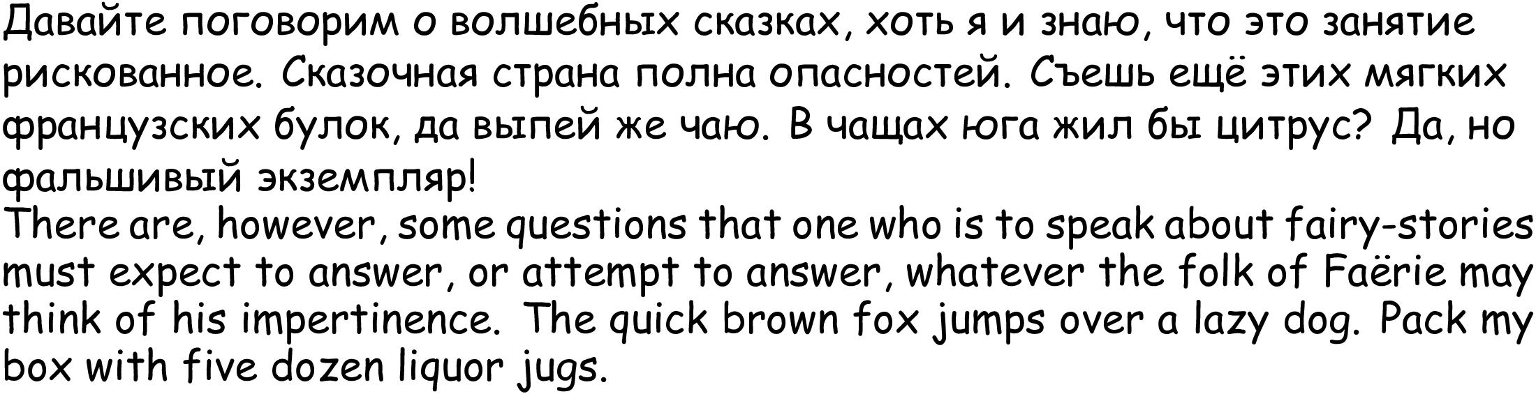
7.4. Comic Sans
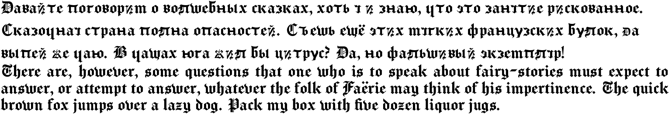
7.6. Fraktur ↔ Kurinto Olde
This is the font the King James Bible is published in.